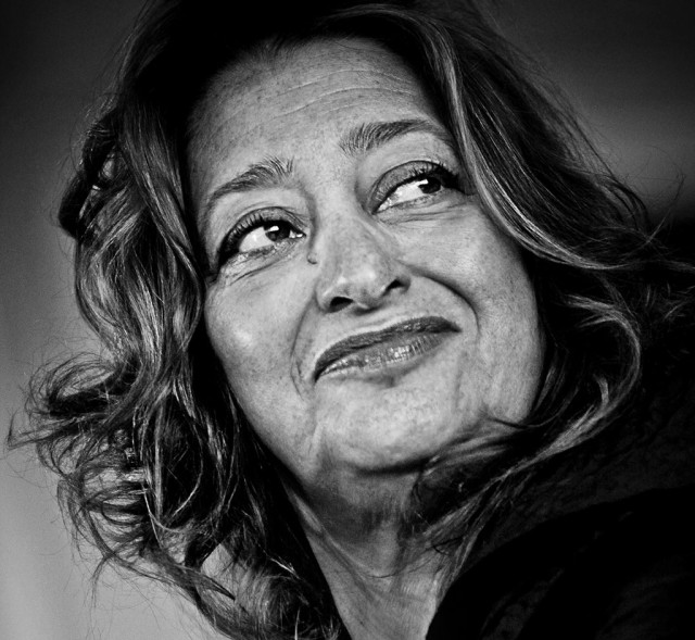
Zaha Hadid (UK)
So closed and compact design comes on Jakob + MacFarlane, so open is Hadids surprising proposal for the casino. They also built for the walkers and turn public spaces on its priority list. Unlike the French firm she does not provide for them on floor, but on the ground, like Citicorp building could arouse the love of the New Yorkers for its public space. With her schedule ‘the fall of the Atlantic Wall’ put it last Pritzker Laureate short and her statement of a lifted program neer.Het building with its seemingly haphazard arrangement of volumes, corridors and vertical circulations, resulting in a porous entirely with innumerable vistas to Area.
If any of the four final draft proposal takes into account the poor orientation of the Belgian coast. The sun here has the ability to whirl down on the sandy beach by the open spaces between the volumes. The gaps also offer a nice variety with the full densely built coastline. This concept is reminiscent of the powerful signal that gives the National Library of France by Dominique Perrault. The urban void between the four book towers’ constitutes a gap in the built-up skyline on the Paris banks. Hadids design could give the same distinctive message.
Dominique Pieters


