BURO II
Out of concern for a quality-enhancing approach and to sustainable and future oriented building, are four points our guide: strong architectural concepts (dream), technical perfection (version), cost-conscious approach (numbers) and open cooperation with clients, contractors and colleagues (team).

Vlerick Leuven Gent Management School, Ghent
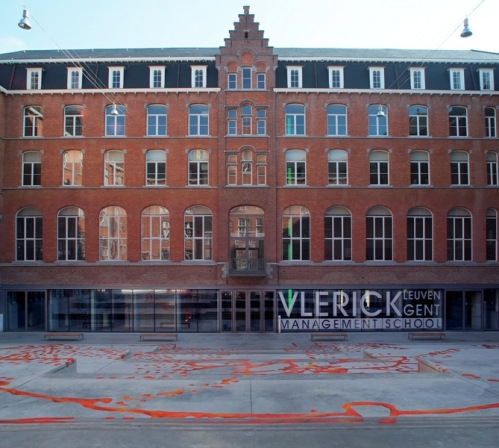
The Major Seminary, a neo-Gothic building from the early twentieth century shone until recently closed a monastic character of inaccessibility, where only the façade was directed to the outside world. The transformation of the building into the new campus for the Vlerick Leuven Management School opens the site to the public. The “campus plaza ‘guides you through an immense staircase to the reception level. The glass façade ensures the openness to the square. Here is the procedure architectrale visible. A new concrete frame as supporting structure between the existing facades of the center block. This creates a versatility within the existing volume; therefore in the twelve-meter-wide column-free space sufficient freedom of movement to optimally integrate the new features and technologies. This concentration of surgery ensures that the other wings of the building of major renovations were spared; there is the basic interpretation and accentuates the contrast with the existing atmosphere. The courtyard behind the center wing is an oasis of calm, in stark contrast to the semi-campus public square, where the rational educated students are confronted every day with the dream world of Panamarenko. In cooperation with architektenburo R. Berteloot.

Master Nijverheidsstraat – Blekerijstraat, Assebroek-Brugge
The site is located at a walking distance from the center of Bruges. From a certain height there is a magnificent view of the city towers. This view is a strong asset in the field and gives rise to the development of apartment towers. To compensate for the height an important open green space was provided.
For the open space the advantages of the site were used with its moat structure and willows. The existing greenery is organizing the project. The preserve canals provide natural drainage of surface water. A belt of homes makes the transition to the surrounding buildings. Bicycle and motorized traffic are separated. The concept provides four occupation zones with its own typology: a connection with terraced area in the southwest, living on the central green zone, condominiums (four houses in one volume), enacht appartementestorens adjoining the Bloso site. Through different effects each type of housing gets an individuality. In collaboration with the architect Pol Salens.
House V., St. Michiels Brugge
The house is a confrontation with its wooded surroundings. To orient south the house is implanted behind the field, parallel to the street. The driveway leads you to the entrance at the rear. This facade is very closed, in contrast to the open frontage. There is a maximum openness to the environment without sacrificing security and privacy. Large glass surfaces with integrated fixed awnings determine the architectural image and concept; the resident feels “between the trees.” The terrain is maximized because all functions are spread evenly. Driven by simplicity in planning and building facade creates distinctive spaces with simple loop lines which one is easy to orientate.
Telindus NV, Ostend
Zakenkantoor for business in data communication and information processing, competition by invitation – laureate in collaboration with E & L Projects.
The building manifests itself as a white volume. The highway environment is a determining factor for the implantation and the architecture of the building. The building is a signal to the motorway, and protects the quiet green area on the north side from the busy thoroughfare. The reticence on the part of the rapid traffic keeps the noise and the sun against, and stands in stark contrast to the open side to the north side where people eventually approached the building. The openness thus registering the transparency of the business stature. A strict conceived front yard there delivers the necessary environmental quality. Upon entering reinforces a loft with zenithal light the structure of the building. There is the closed higher volume of services and closed office functions; on the other hand a lower volume provides two open working platforms. The void brings centrally in the building light and airiness, and bundles the circulation. The rational industrial structure provides a flexible interpretation; an open plan. The simplicity of the volumes is complemented by the detailing of the glass facades. This creates a functional office building, flexibility for the future, focused on his surroundings.
In partnership with E & L Projects
Campus Technical School KTA, Dendermonde
Open Call laureate of the Flemish Government Architect. The competition program included a study of a spatial master plan and the implantation of a class building of approximately 3,200 m² in the first and 1,800 sqm in a second phase.
Currently spread the various offices of the KTA about the city. In the future, as many schools centralized on the campus on the historical foundations of the town of Dendermonde. The master plan also includes, in addition to the existing new classrooms, renovate buildings with additional practice workshops and possibly a sports hall. The existing campus currently lacks structure and identity. The proposed master plan emphasizes compact build in the right place so that the exceptional environmental qualities can be exploited as well. It also takes into account the maximum proper urban planning, the relics of the historical city wall, the sober architectural concept and the beginnings of a process approach.
All new buildings achieve autonomy and can be built in phases. The alternation of buildings and open spaces contribute to the creation of a simple structure, which allows to organize the variety of program areas and in an orderly manner. The construction of the first phase, designed around a square courtyard, makes it possible to meet in a smooth way to the very diverse needs and space requirements.
The emphasis on sustainable building rational structure, flexibility, energy friendliness, easy maintenance and low-tech solutions and functional and high-quality outdoor spaces.
Tight budgets and strict planning are important preconditions in the command. Together with the clients and users, the architecture is compared to the desired educational concepts and pedagogical principles and developments; work together on a future-oriented school. The realization of the project will be done in several phases and autonomous. The start of the work is expected in the spring of 2004.
Furnibo, Veurne
Furnibo is a company for general construction, industrial construction, environmental and construction, with specialty concrete. The company site is delimited by a 2.80-meter-high concrete wall, a prefab shed and office building erected in a short span of time. The basic concept of 13.00 × 13.00 × 16:50 meter vertical office volume, the inner – and outer walls entirely onsite are cast in concrete visible, maximizes the potential of self-leveling and self-compacting concrete (Rheo Dynamic Concrete). Design decisions on gable vents, stability and detailing of the massive volume are a direct consequence of the characteristics of this material. Contained by the concrete wall mass of the overlying floor facades can be used as a beam wide openings. The edges of the building at the height of the square windows on the corners ‘dematerialized’ by the corner of two facades focus. In this way, concrete radiate a lightness. All wall openings are logically defined: a wide strip opening in the northern facade where the workstations are located, closeness to the south, except on the ground floor where the entrance zone is located. Above this entrance facade is withdrawn within the volume a void in air “created the glazed façade provides a view of the inside of the concrete outer shell that protects office area of the southern lights. The office achieved in three phases each lasting 5:50 bulk meter overall height is 16.50 meters.
Kennedy Hotel, Kortrijk
The reception of Hotel Kennedy is very spacious and airy understood. The view on the patio at the back ensures a green and quiet accent. The entrance hall is not only acts as a reception for hotel guests, but also as a meeting place before and after seminars, which can be nagekaart in a casual atmosphere. The reception area makes the connection between the restaurant and the seminar rooms. The sober and clean lines of the foyer contrasts with the warm, cozy restaurant section, but complement each other perfectly. Expanding the existing hotel (increasing the capacity from 48 to 64 rooms), linked to the expansion of the restaurant and the kitchen, got a comprehensive approach by the symbiosis between interior and architectural firm Buro Buro II.
The restaurant, which can operate independently of the hotel, is controlled by its material and color the rest of the hotel visitor. The warm red color behind the counter is repeated on the wall in the buffet restaurant. There you can dine in a cozy setting, away from the crowds typical of the hotel happen.
Biognost, Bissegem
Building a biotech company with storage space and offices on land situated in a SME park. Architecture can be a legitimate means for communicating the corporate identity of a company. The working environment is ‘move seems’: a friendly place to receive clients, transparency from reception to offices, a buiten’ruimte as a terrace in a living space. This inside-outside relationship is strengthened here by the wood of the flooring inside by pulling the wooden planking on the outside terrace. From the terrace is slightly to the production and storage.
A simple modular skeleton is enveloped by light leavened architectural concrete panels. Clear and simple principles and readable design decisions lead to the essentials. There is no place for abundance, the building is not unnecessarily complicated.
Developing ancient site ‘Structo’ Bruges
Research on the redevelopment of the former concrete factory Structo the Damme canal in Bruges. In consultation and collaboration with the city of Bruges and the principals, the results are summarized in a spatial masterplan. This describes in conjunction typology of housing, the desired density, the mix of destinations, the openness and internal circulations on the site, the dimensions and location of the buildings, underground constructions … This further refinement of the BPA late allow the entire zone as a function of the market, to develop at different stages without losing the overall concept of the eye.
Lecture by Henry Vermoortel Herman Jult and Salvatore Bono

