Humus layer
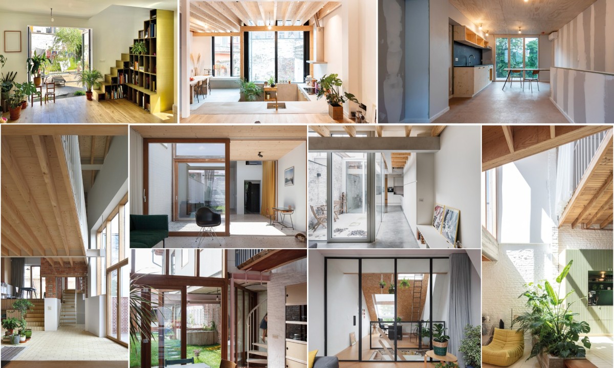 Promising designers #1 – Private construction projects
Ghent is a true city of architecture, with a diverse and rich heritage. The city is home to a number of renowned design schools. Many talented designers work here. This was more than evident in the huge harvest of projects during the first Ghent Architecture Prize. Many private projects were included. We provide a forum for talented architectural firms to present their vision and their project. A piece of Ghent on a mini scale.
Caroline Lambrechts and Machteld D’Hollander | House Patijn (2014-2018)
 Filip Dujardin
Caroline Lambrechts en Machteld D’Hollander | Huis Patijn (2014-2018)
 Filip Dujardin
Caroline Lambrechts en Machteld D’Hollander | Huis Patijn (2014-2018)
 Filip Dujardin
Caroline Lambrechts en Machteld D’Hollander | Huis Patijn (2014-2018)
 Filip Dujardin
Caroline Lambrechts en Machteld D’Hollander | Huis Patijn (2014-2018)
 Filip Dujardin
Caroline Lambrechts en Machteld D’Hollander | Huis Patijn (2014-2018)
Description
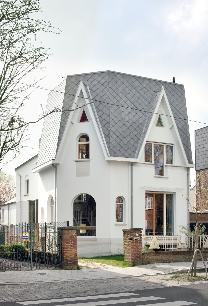
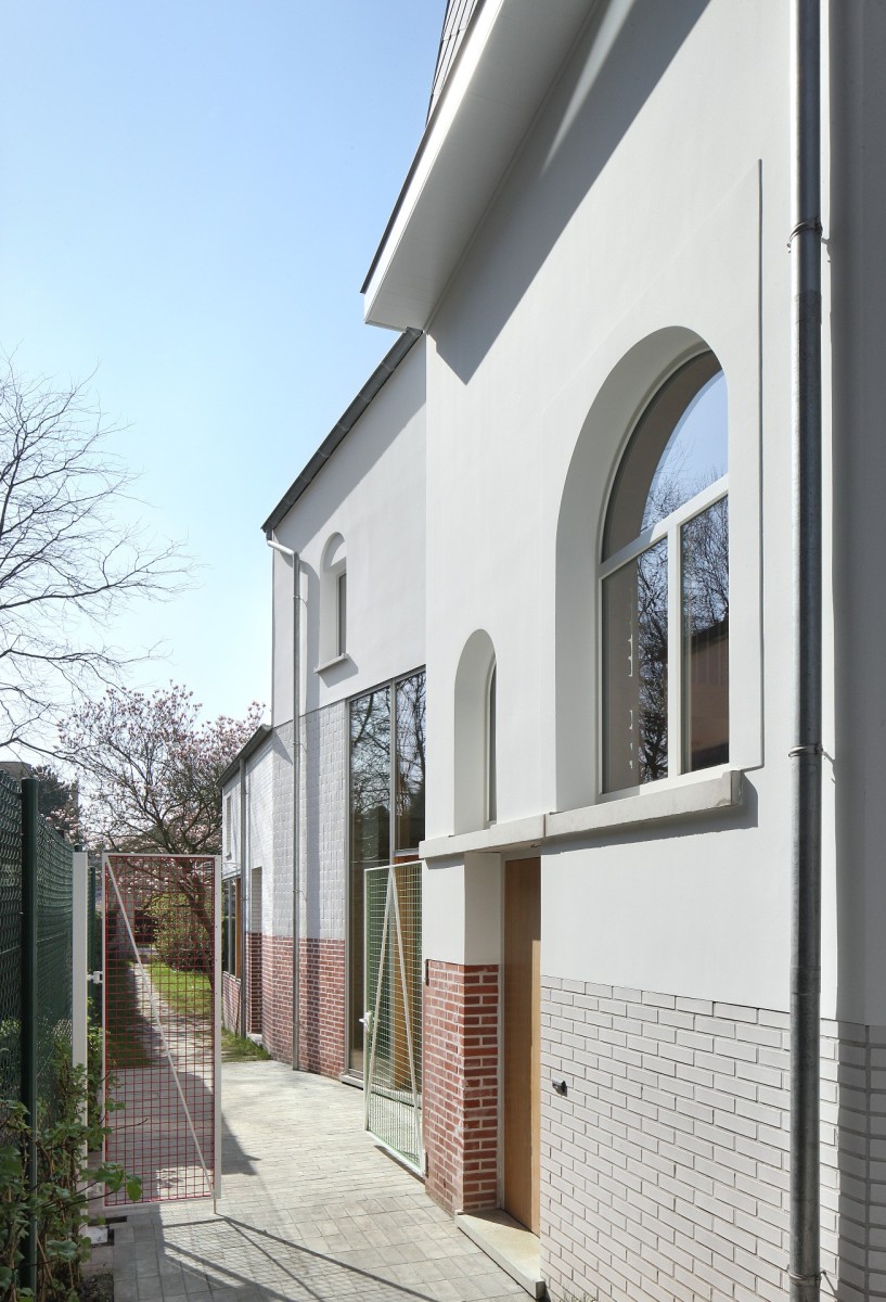
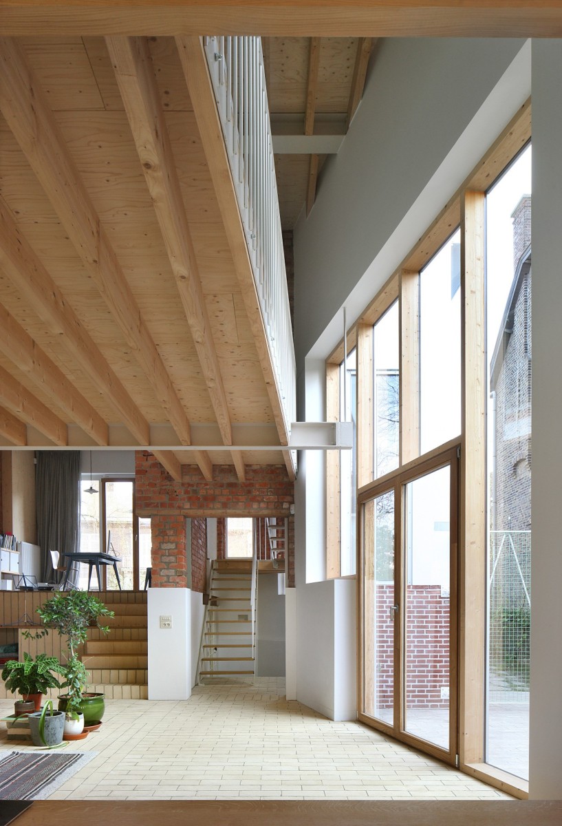
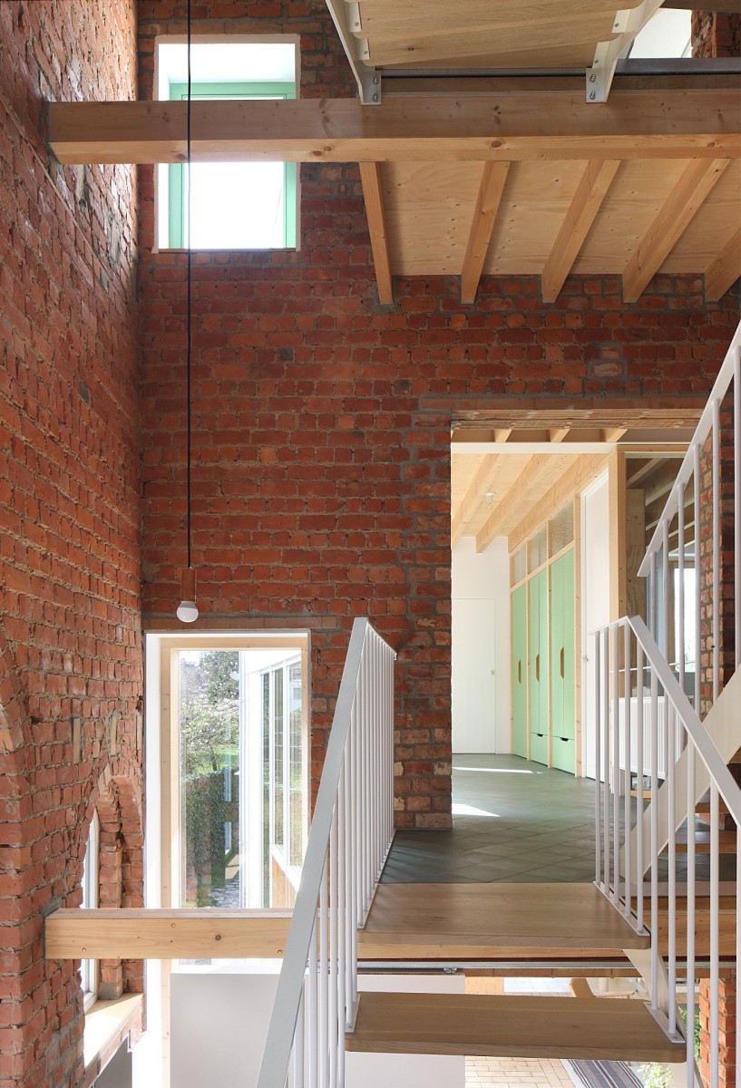
Huis Patijn is the renovation of a small but stately house from the 1930s. The original house was built in red brick with a mansard roof. The renovation consisted of stripping the house down to its structural brick walls, which remain visible throughout the interior, while the outer walls were wrapped in white plaster. At the rear, an extension was realised in two additional volumes in timber frame construction.
The pointed roofs in cement slates connect old and new in one continuous surface from the street to the garden. Inside, the weight of the original red brick is contrasted with the light wooden construction of the extension. The living room unfolds over the entire ground floor as one continuous space, stretching along different levels from the front room to the garden side dining room. Large windows provide an abundance of sunlight and open up the view of the garden, while a number of voids open up the entire building, with interior windows providing views of the various rooms. On the upper floors, small bridges cross the central atrium to the extension. Large windows overlook the green surroundings of the house.
Qualities
A major challenge for contemporary architecture is to combine sustainable building, with its extensive regulations, with respect for the existing heritage. Old houses are therefore all too easily demolished and replaced by new buildings. It is much more complex to transform a detached house with character into a sustainable home while retaining the specific architectural language and supplementing it with a contemporary language. Langkous House was always an essential part of the charm of the Rijsenberg neighbourhood with its Interbellum architecture. After the renovation, this is still true, and more. To meet the standards, the front house was completely packed. However, through thorough detailing and attention to materials, the character was preserved and even enhanced. The many details refine the exterior walls of the house: the windows are accentuated with brick patterns or with a subtle relief in the plaster, the colours varying from red to white and green. The extension at the back only becomes visible when you walk down the side path; a kink in the side wall hides the additional volumes from the street. In a play of contrasts, the different materials of the existing building are continued in the extension. In this way, the front and rear houses form a whole, connecting two architectural periods.
Atelier Fréderic Louis | Appartement Boudewijn (2015-2018)
 Evenbeeld
Atelier Fréderic Louis | Appartement Boudewijn (2015-2018)
 Evenbeeld
Atelier Fréderic Louis | Appartement Boudewijn (2015-2018)
 Evenbeeld
Atelier Fréderic Louis | Appartement Boudewijn (2015-2018)
 Evenbeeld
Atelier Fréderic Louis | Appartement Boudewijn (2015-2018)
Description
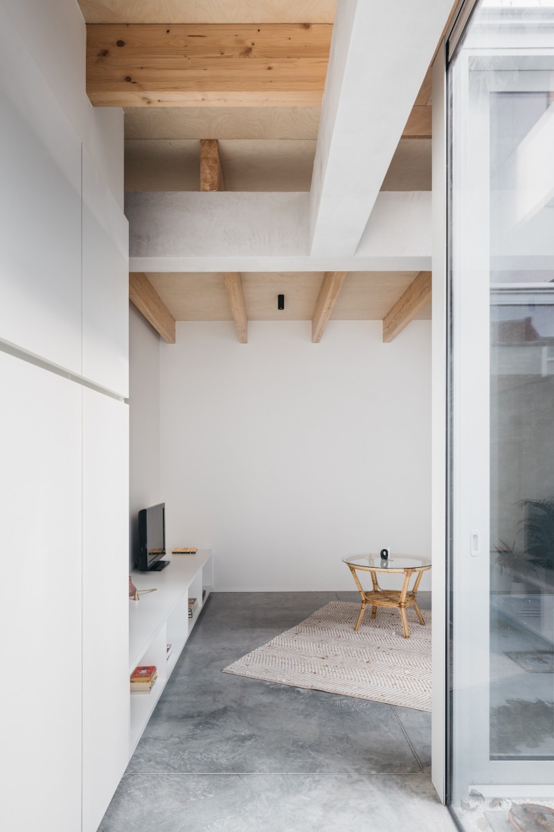
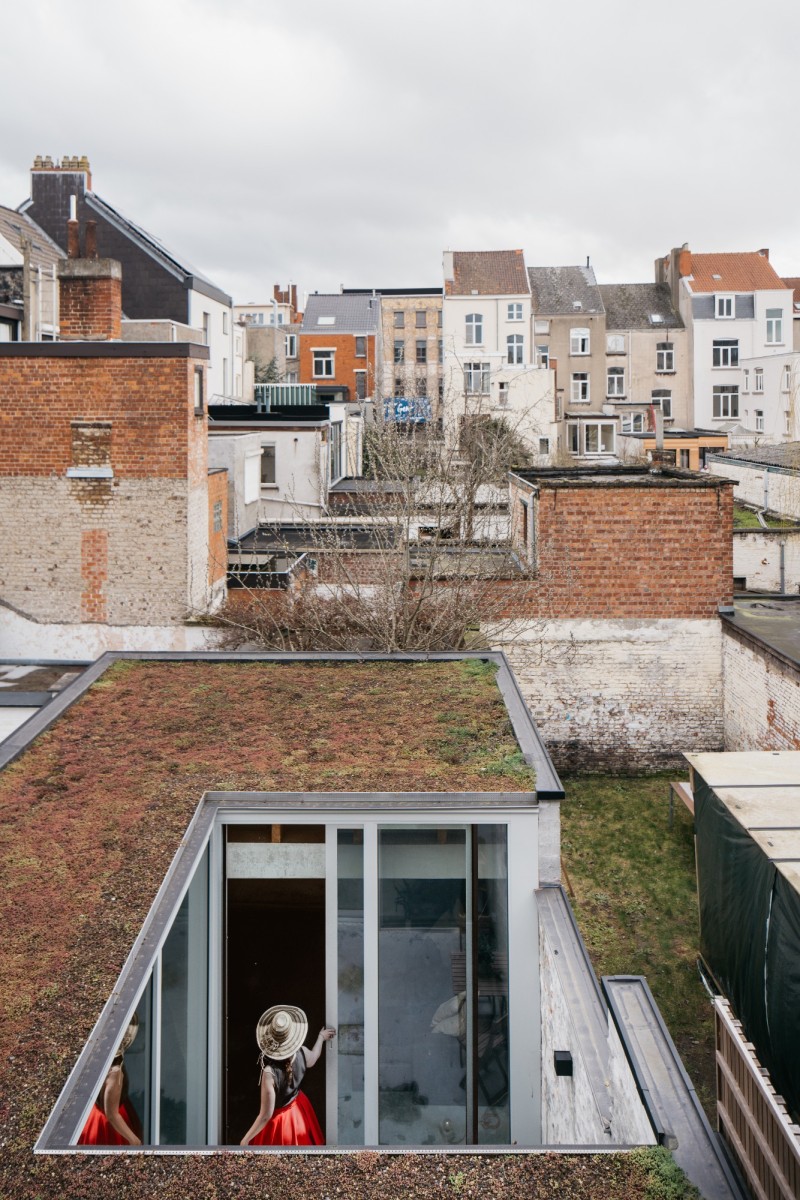
The site is located in a densely built-up area, just north of Ghent’s largest train station. In recent decades, the original row house was divided into separate student rooms, with a larger flat on the ground floor. This flat was characterised by dark living spaces, low suspended ceilings and a lack of windows, resulting in an unpleasant living environment and no relationship at all with the urban environment. The renovation of the ground floor was extensive. The existing extension was demolished. A new start. The layout of the flat was completely renewed. The functions were mirrored. Sleeping at the front and living around the new central patio. Maximum daylight for all living areas.
Qualities
The roof structure is the most important architectural element of the new extension. The concrete beams float around the patio and support the wooden beams and plywood ceilings. The beams are positioned so that daylight can penetrate deep into the rooms. The bare materials are also the finishing touch. Because of its central location and the three-metre-high windows, the patio becomes a fully- fledged outdoor space. The floor of the flat continues in the patio, both in terms of level and material, thus creating a sense of unity. Light materials were deliberately chosen for maximum light reflection and a feeling of space.
Marge architects | Weifelwand (2017-2018)
 Johnny Umans
Marge architecten | Weifelwand (2017-2018)
 Johnny Umans
Marge architecten | Weifelwand (2017-2018)
 Johnny Umans
Marge architecten | Weifelwand (2017-2018)
Description
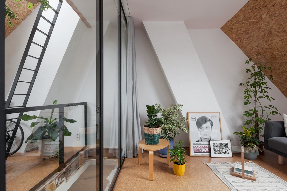
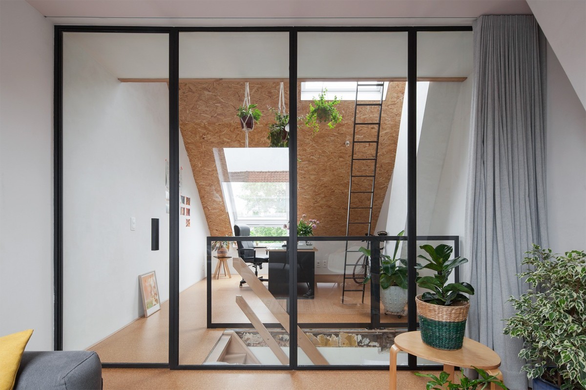
It was winter again. Classic problem: an uninsulated roof in poor condition with a number of dark, low spaces underneath. The roof bends even more than can be expected from an old purlin roof. New roof with new expectations. They want to put guests to sleep there, relax in a drawing studio and store things as is expected of attics. Storage, sleeping and recreation do not usually take place at the same time. Preferably not rooms with walls then, but do something more ambiguous, let the space continue. Below the triangle is a mezzanine floor, aligned with the stairwell. Beyond the stairwell, steel and glass joinery, further on a parked curtain, further on someone is reading a magazine. On the other side of the stairs, someone is drawing an animal on paper. The evening light is filtered through the poplars and projected onto the field of the room. The curtain closes.
Qualities
Sustainability is not only technical or energy-related. It is also about themes such as densification, compact living and ‘adaptable’ construction. Despite the extremely small scale of this project, it does touch on a few themes. The wall is crucial. Steel, glass and curtains mediate the use of the spaces and allow multiple uses, both simultaneous and split in time. The formula allows for life now, but also for tomorrow. Furthermore, this is a project where the budget stimulates creativity rather than extinguishing it: OSB cladding with white day-side edges, simple L-profiles as steel walls with a shadow gap to make the structure appear narrower than it actually is, an interesting shade of light and sight in what is in itself a standard velux. A low budget and multiple use of space on a small area: a demonstration of the feasibility of quality compacted and affordable living in the city.
Atelier Avondzon i.c.m. macadam.atelier | Project Korenbloem (2018-2020)
 studio scott
Atelier Avondzon i.s.m. macadam.atelier | Project Korenbloem (2018-2020)
 studio scott
Atelier Avondzon i.s.m. macadam.atelier | Project Korenbloem (2018-2020)
 studio scott
Atelier Avondzon i.s.m. macadam.atelier | Project Korenbloem (2018-2020)
Description
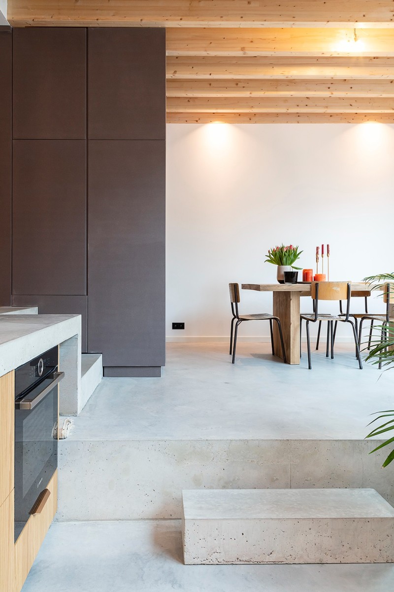
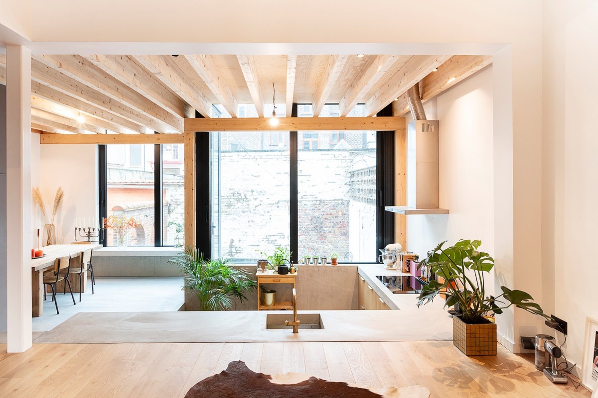
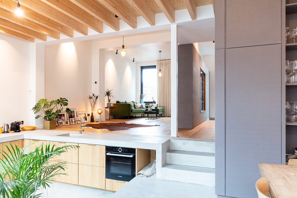
An existing terraced house had no link with the lower town garden and the existing extension did not provide sufficient quality of life. By converting a basement space into a living space, the link to the garden and the feeling of space of the extension were maximised. This deeper extension gave the impetus to play with a ‘cascade concept’. From the façade, the passer-by strolls along different spaces, each of which has been given its own level. This creates a playful relationship of heights and lows between the different functions throughout the ground floor. From each level of the house, there is also a view of the city garden.
Qualities
By converting a basement space into a living space, it perfectly links the low city garden with the existing front building. Each level/living space has been differentiated in such a way that each space is attuned to the other. For example, the kitchen worktop is built into the floor of the living space and the dining space provides the circulation to these functions. The levels create a playful relationship to each other. A wooden roof and support structure provides the necessary warmth throughout the building. The rough concrete materials provide a rugged touch. The sliding windows can be completely opened up so that the dining area and kitchen become part of the existing building. Despite the limited surface area of the ground floor (70m2), it feels like one big room. That is why the cupboard in grey MDF is not fitted from floor to ceiling nor is it fitted with doors to increase the feeling of space.
Macadam atelier | Weidestraat (2018-2020)
 Tim Van De Velde
Macadam atelier | Weidestraat (2018-2020)
 Tim Van De Velde
Macadam atelier | Weidestraat (2018-2020)
 Tim Van De Velde
Macadam atelier | Weidestraat (2018-2020)
Description
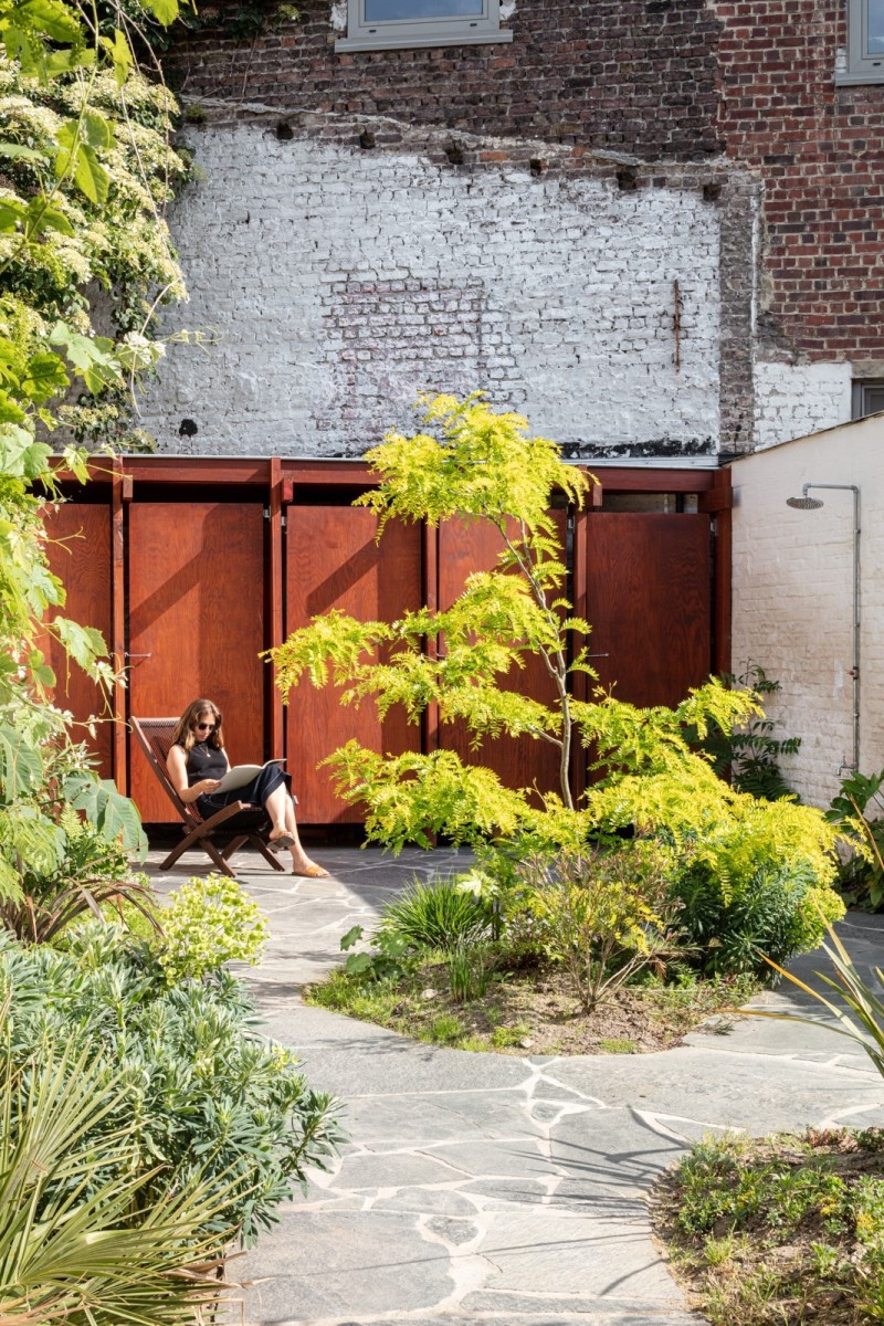
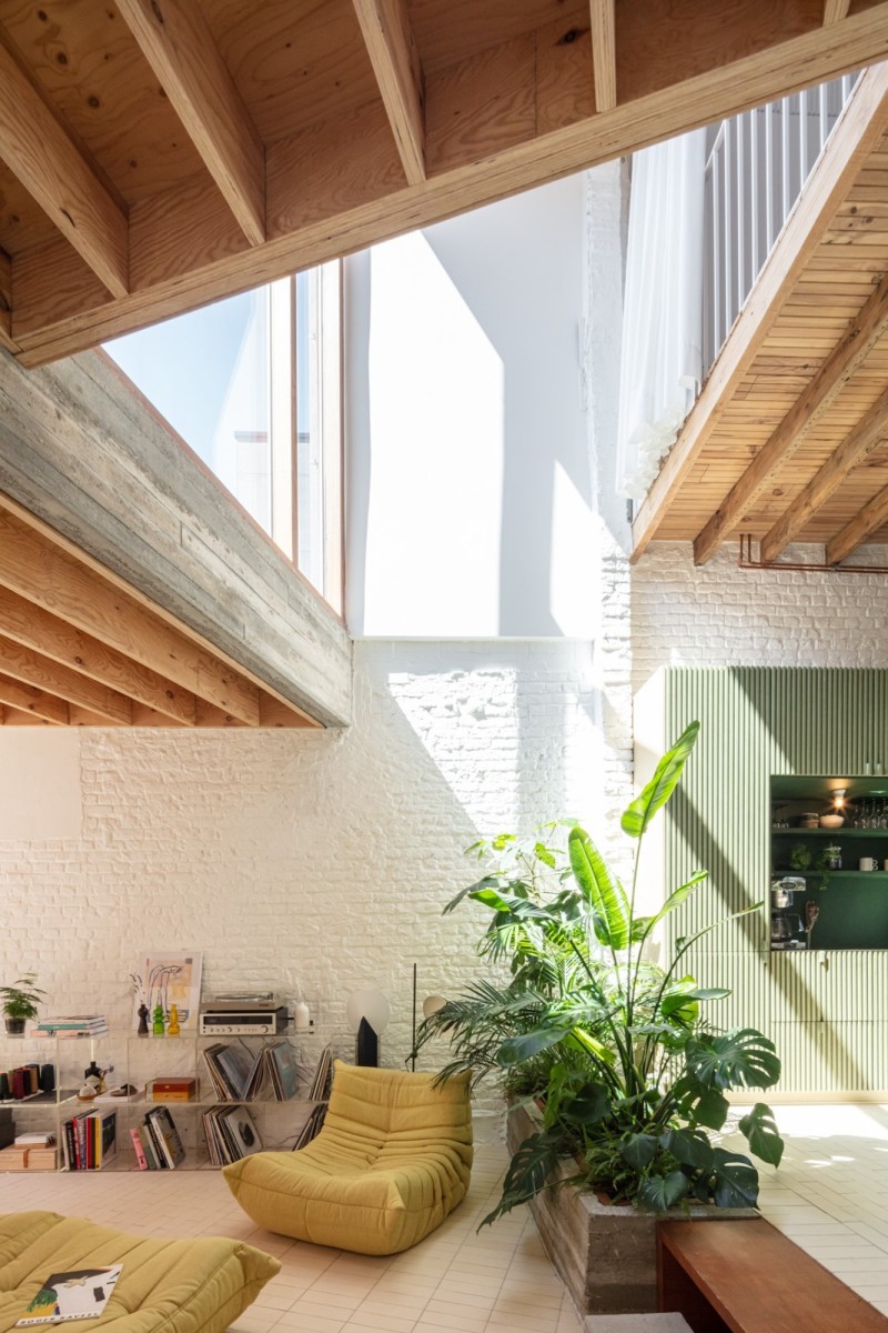
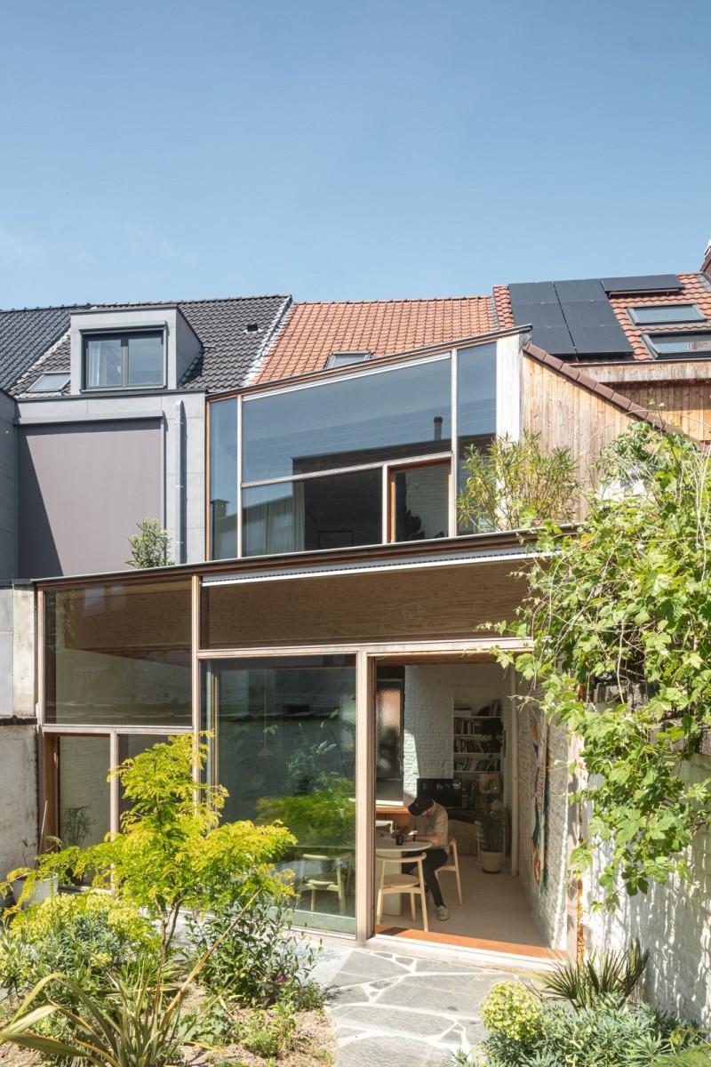
A dark terraced house was transformed into a playground of volumes of space, different materials and varying incidence of light. The existing layout was preserved as far as possible, but by changing the existing circulation through the previous living areas, the ‘unusable circulation’ can be used as new rooms and/or storage space. A light atrium allows light to pass through the entire house. All the living functions are organised around it, enjoying the light and a view of the garden. The functions around the void are housed in a split level which creates a nice, varying relationship. The extension has a sloping volume that follows the line of the plot and also forms the connection between the two neighbours.
This slanting shape creates a different sense of space, as well as playing with the incidence of light. The extension in a ‘sitting pit’ provides more intimacy and playfulness throughout the linear house, as well as a changing relationship between the spaces.
Qualities
The Meadow Street project shows the potential of a terraced house. The layout consisted of a narrow and dark entrance hall, leading the resident to the stairwell, to which the living areas were connected. The kitchen and technical room were located in a dilapidated extension, and despite the south-facing garden, “little light” was one of the house’s drawbacks. The many suspended ceilings limited the feeling of space and a lot of ‘usable’ space was wasted on circulation. Now the house has a tropical touch and is bathed in light. Throughout the house, sturdy materials are combined with soft, durable materials. In short, it is ‘on holiday in a terraced house’. Bonus: A nice element in the house is the bathroom unit where all the sanitary equipment is accommodated in 1 unit. The atmosphere of the garden and its storage area was inspired by a trip the residents took to ‘Termas Geometricas’ in Chile, where tranquillity and nature prevail.
Atelier rofu | Inschuifhuis (2020-2021)
 Dewald van Helsdingen
Atelier rofu | Inschuifhuis (2020-2021)
 Dewald van Helsdingen
Atelier rofu | Inschuifhuis (2020-2021)
 Nikolaj De Meulder
Atelier rofu | Inschuifhuis (2020-2021)
Description
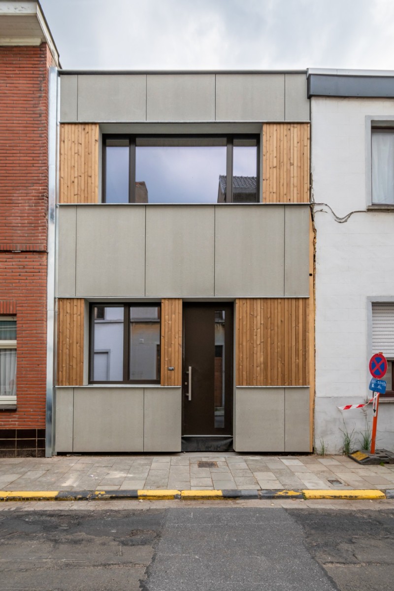
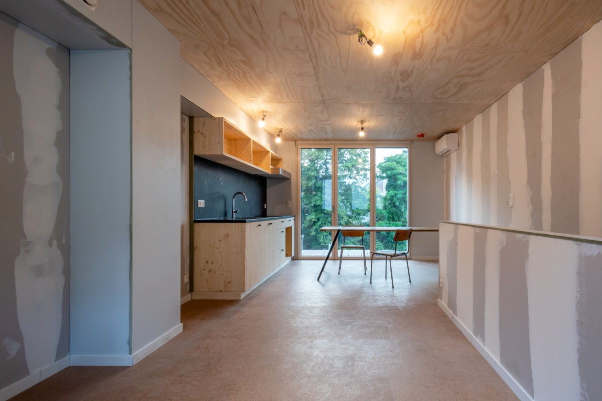
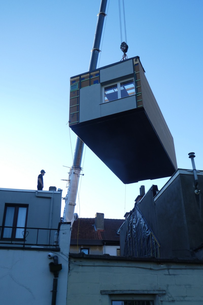
The InschuifHuis#1 (Move-in house) is the first result of a conversion process developed by LabLand together with residents and experts to replace houses that are difficult or impossible to renovate. The core of the solution is in the word itself: literally slide in a new, circular and affordable house where the old one was demolished. The construction period between demolition and completion was just one month. The resident went through the building process carefree and the neighbourhood hardly suffered any inconvenience. InschuifHuis#1 is more than just a house. The InschuifHuis is a scalable process to replace old terraced houses both quickly and circularly with (almost) energy-neutral homes. Moreover, it leaves much room for architectural creativity. InschuifHuis#1 transformed a dark terraced house into a well-considered bel-etage house with lots of light. Ghent got the scoop. InschuifHuis#1 was demolished, moved in and delivered in June 2021 in Ledeberg. A game changer towards 2050.
Qualities
Inschuifhuis#1 is fossil-free. It is a near-zero energy house, built with healthy, bio-environmental materials and ‘off the gas’. InschuifHuis#1 is circular. The house is adaptable and the functional layers can be replaced separately. Many materials from the old house were recovered: the new kitchen table, for example, is made from the old rafters. InschuifHuis#1 is silent. The new communal wall is disconnected from the existing one. The most effective acoustic solution for terraced houses.
InschuifHuis#1 is fast and carefree. With only one month of construction, the renovation process took away a lot of worries from the resident, neighbours and neighbourhood. InschuifHuis#1 is affordable. A well thought-out design and rigorous construction process limited the building cost. Move-In House#1 is scalable. With #2 and #3 already in preliminary design, it contributes to the major renovation challenges for the 2050 climate goals. And the really exceptional thing is that these qualities all come together in 1 row house!
NWLND Rogiers Vandeputte i.c.m. Marie Huyghe | Patiohouse (2014-2019)
 Johnny Umans
NWLND Rogiers Vandeputte i.s.m. Marie Huyghe | Patiohouse (2014-2019)
 Johnny Umans
NWLND Rogiers Vandeputte i.s.m. Marie Huyghe | Patiohouse (2014-2019)
 Johnny Umans
NWLND Rogiers Vandeputte i.s.m. Marie Huyghe | Patiohouse (2014-2019)
 Johnny Umans
NWLND Rogiers Vandeputte i.s.m. Marie Huyghe | Patiohouse (2014-2019)
 Johnny Umans
NWLND Rogiers Vandeputte i.s.m. Marie Huyghe | Patiohouse (2014-2019)
Description
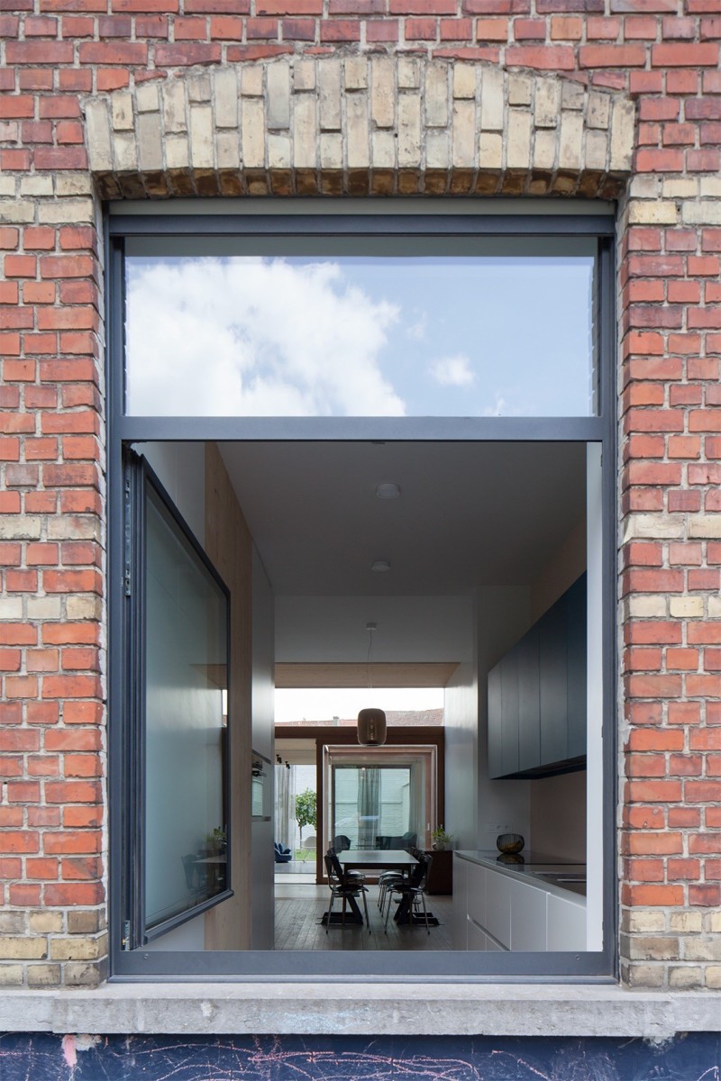
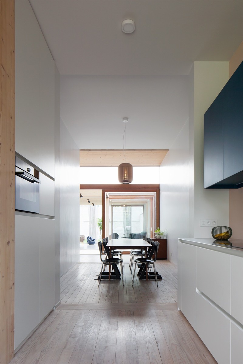
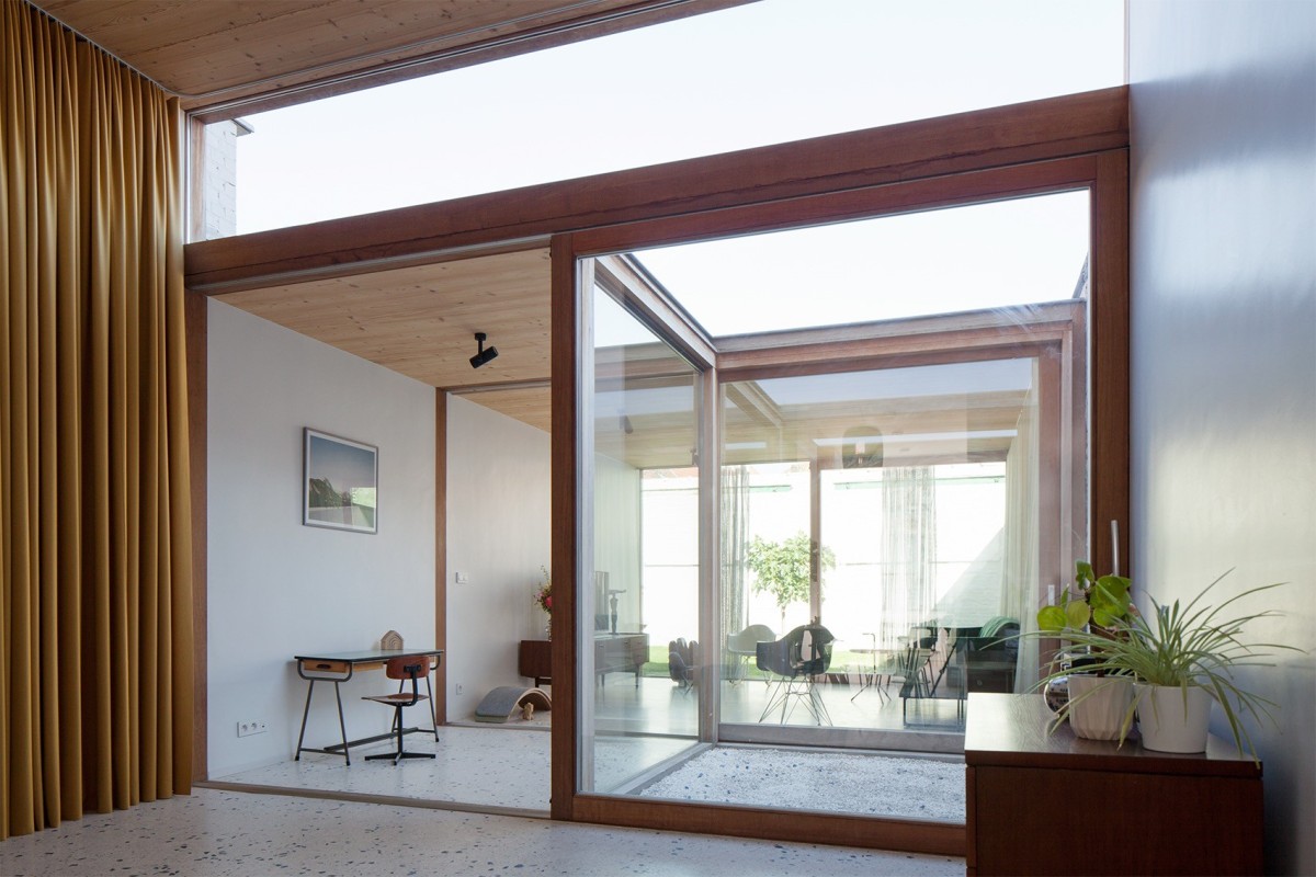
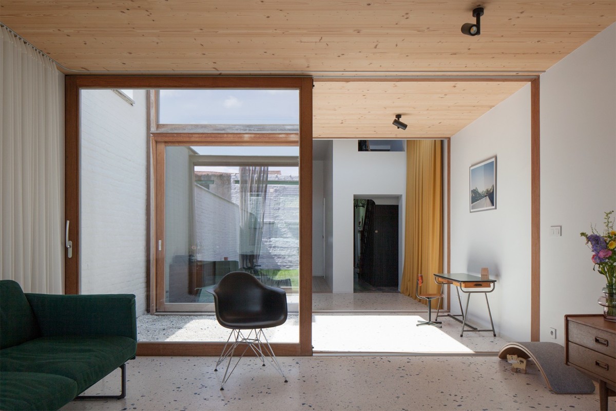
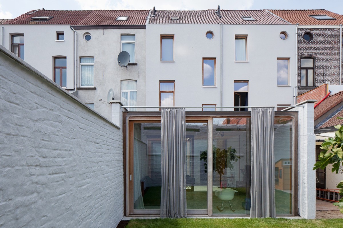
The house was built in 1908 as the central house in a series of 5. The main building was preserved and rebuilt with respect for the past. The room arrangement remained the same. The only major change is a thickening of the wall between the entrance and the front courtyard to a wall of cupboards with a toilet. The typical rear extension with kitchen and bathroom, which was adapted and added on during the last century, was completely demolished in order to create a light garden room. The aim was to achieve a very simple and purified concept. The entire rear building is constructed as a construction kit consisting of planes. Both horizontally and vertically. The whole is structured by 3 identical sliding windows that define other spaces depending on their position. In combination with the curtains, countless configurations arise. The last room is an outdoor space with a green square as a basis. The exterior curtain functions as a sunshade.
Qualities
The design is more than a purified game of proportions. It is a vision on the temporary occupation of space in the city, building on an existing fact, adapted with reversible interventions. The 100-year-old front was respectfully filled in with the sleeping quarters and sanitary facilities. Only the rear façade to the rear building was structurally opened up. The damaged rear building was demolished to make way for an experiment. A characteristic dynamic architecture that is very specific and peculiar to the users. A white canvas that is flexibly filled in and enters into dialogue with the front. Dynamic and reflective. A light ‘temporary’ garden room where people stay in the evenings and weekends, acoustically and thermally closed off by heavy curtains. The lightness is translated into sophisticated detailing and materials. Built to last, without mortgaging, but also to be dismantled if the next occupant wants to make his own mark.
LDSRa i.c.m. Olivier Goethals | Huis Valine (2017-2021)
 Michiel De Cleene
LDSRa i.s.m. Olivier Goethals | Huis Valine
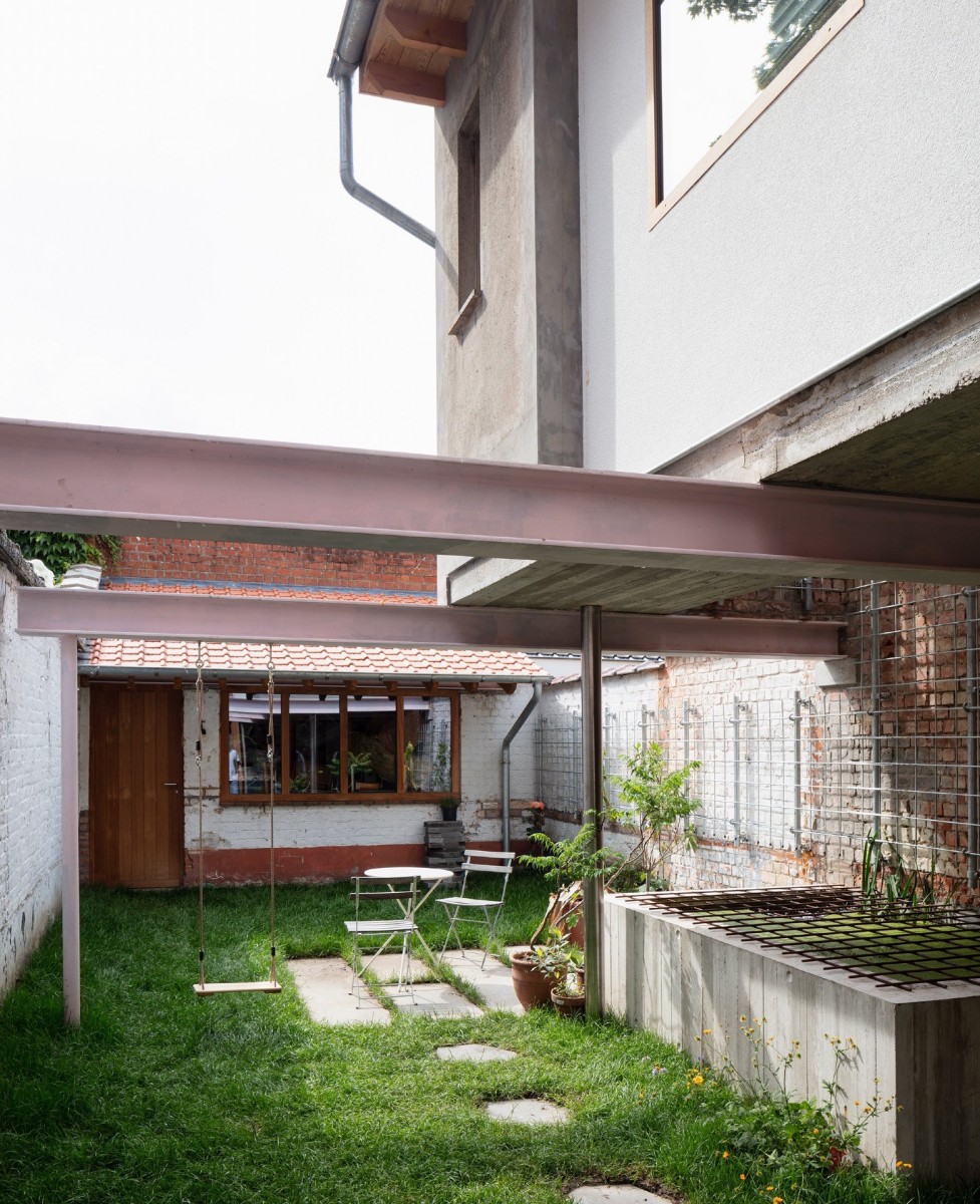 Michiel De Cleene
LDSRa i.s.m. Olivier Goethals | Huis Valine
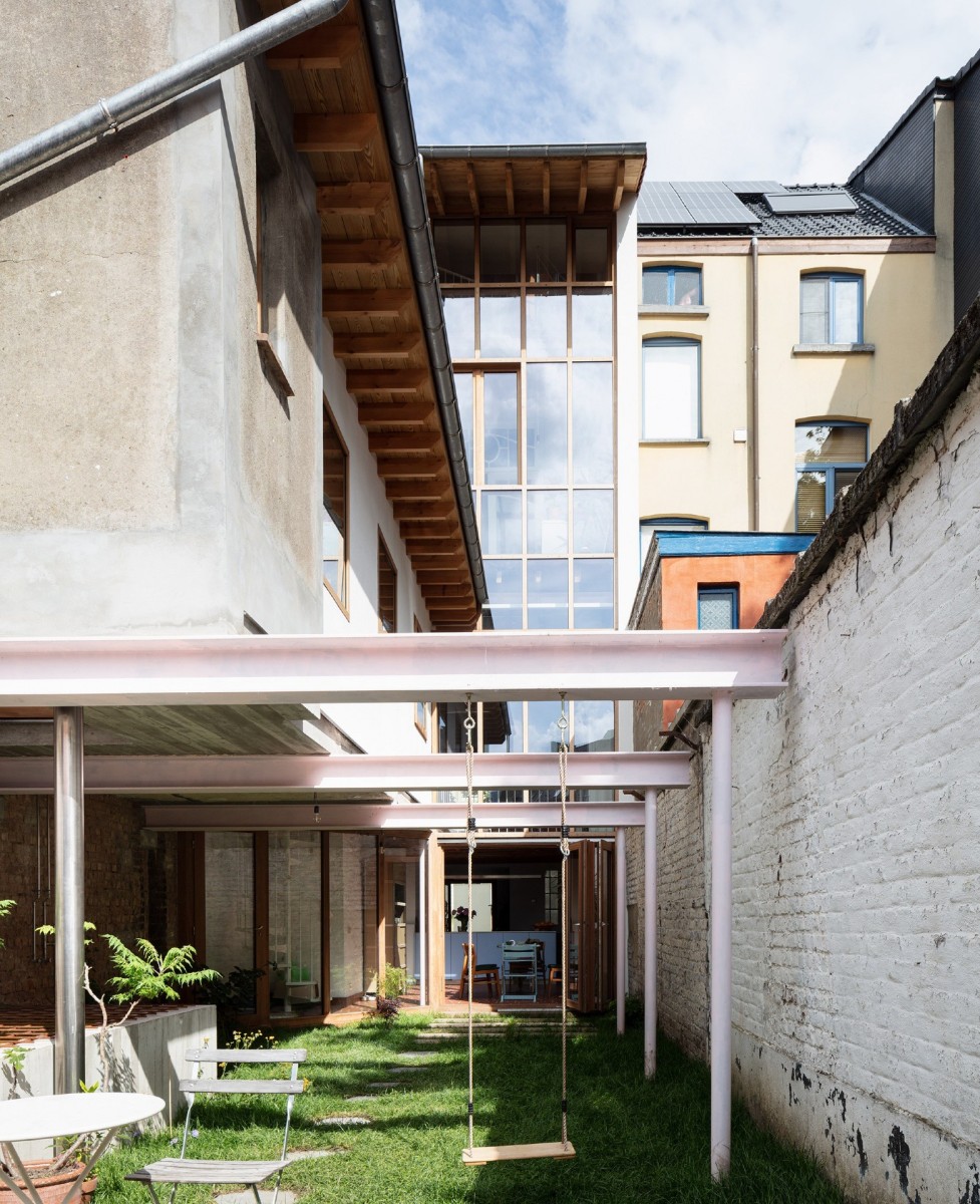 Michiel De Cleene
LDSRa i.s.m. Olivier Goethals | Huis Valine
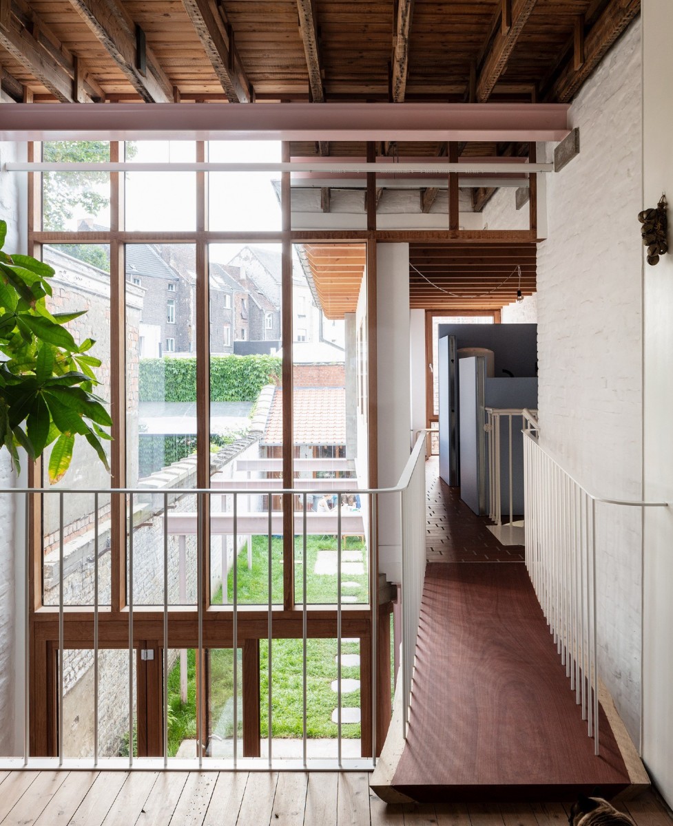 Michiel De Cleene
LDSRa i.s.m. Olivier Goethals | Huis Valine
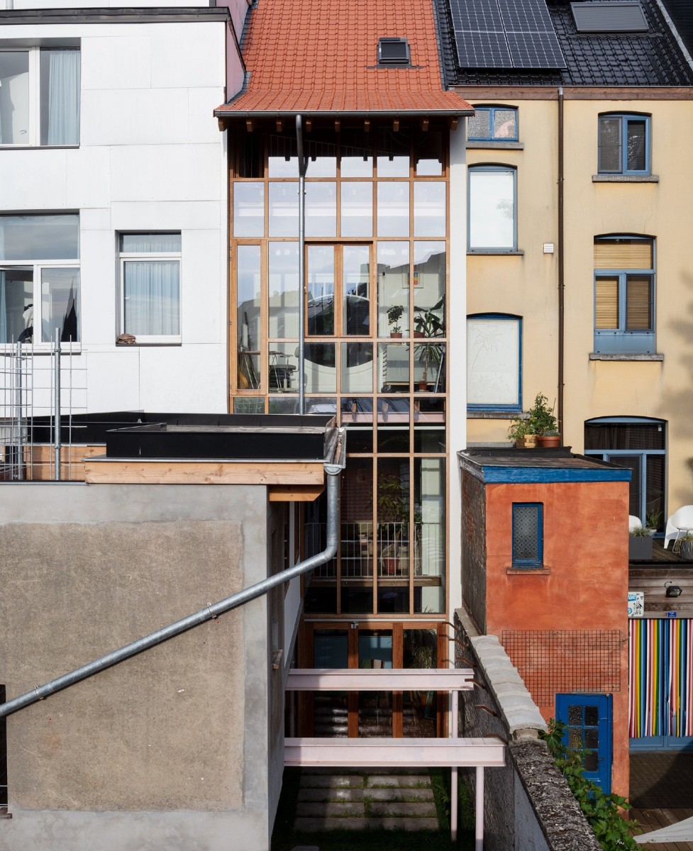 Michiel De Cleene
LDSRa i.s.m. Olivier Goethals | Huis Valine
Description
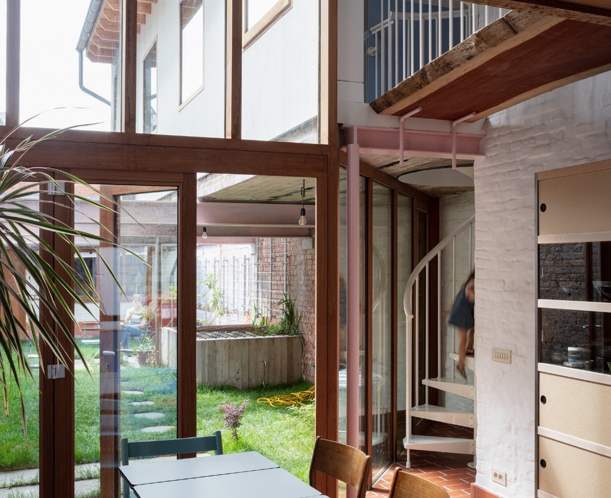
Valine is the conversion of a narrow, high and deep terraced house. Before the conversion, it was a spacious and pleasant house with a small garden facing west. On the ground floor, the veranda and the ground floor of the extension are demolished. The small garden turns into a large garden with a floating caravan above it. The living spaces are organised around the transition between inside and outside, in depth and in height. The existing staircase, the spiral staircase, the void and the bridge create a loop between the kitchen on the ground floor and the living space and caravan on the first floor. In the caravan, a storage room, an extra bathroom and a toilet will be created. The offices are organised on the second floor. The offices have access to a roof garden and a bay window. The rooms on the third and fourth floors will be arranged as bedrooms with a bathroom.
Qualities
Valine is a personal project. It is radical in its interventions and empathetic in how it gives place to life in and around the house. The house is daringly designed and richly detailed. The relationship between the rooms and the floors is enhanced by removing floors. The organisation in plan is derived from the design in section. The house seems to have an extra floor. And there are a number of extra rooms in the house. This makes the house generous and indulgent. The joinery of the rear facade, the canopies and the folding door make the relationship between inside and outside pronounced. The collection of rainwater in the pond gives the project an extra dimension. During the day, you slide along with the light of the sun. The folding door is open. The boundary between inside and outside fades. We would like to invite you to come and visit us.
Studio MOTO | Huis Arion & Marie (2017-2019)
 Studio MOTO
 | Huis Arion & Marie (2017-2019)
Studio MOTO
Studio MOTO | Huis Arion & Marie (2017-2019)
 Studio MOTO
 | Huis Arion & Marie (2017-2019)
Studio MOTO
Studio MOTO | Huis Arion & Marie (2017-2019)
 Studio MOTO
 | Huis Arion & Marie (2017-2019)
Studio MOTO
Studio MOTO | Huis Arion & Marie (2017-2019)
 Studio MOTO
 | Huis Arion & Marie (2017-2019)
Studio MOTO
Studio MOTO | Huis Arion & Marie (2017-2019)
Description
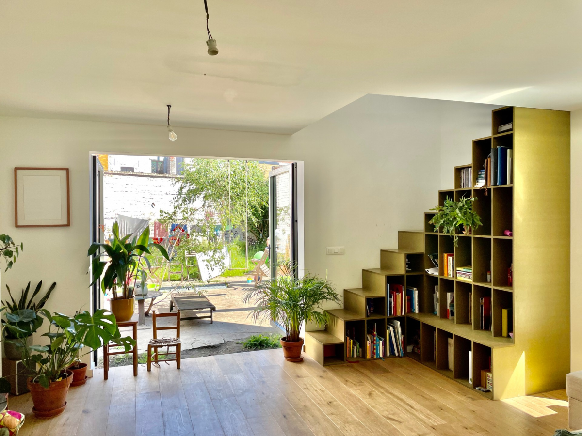
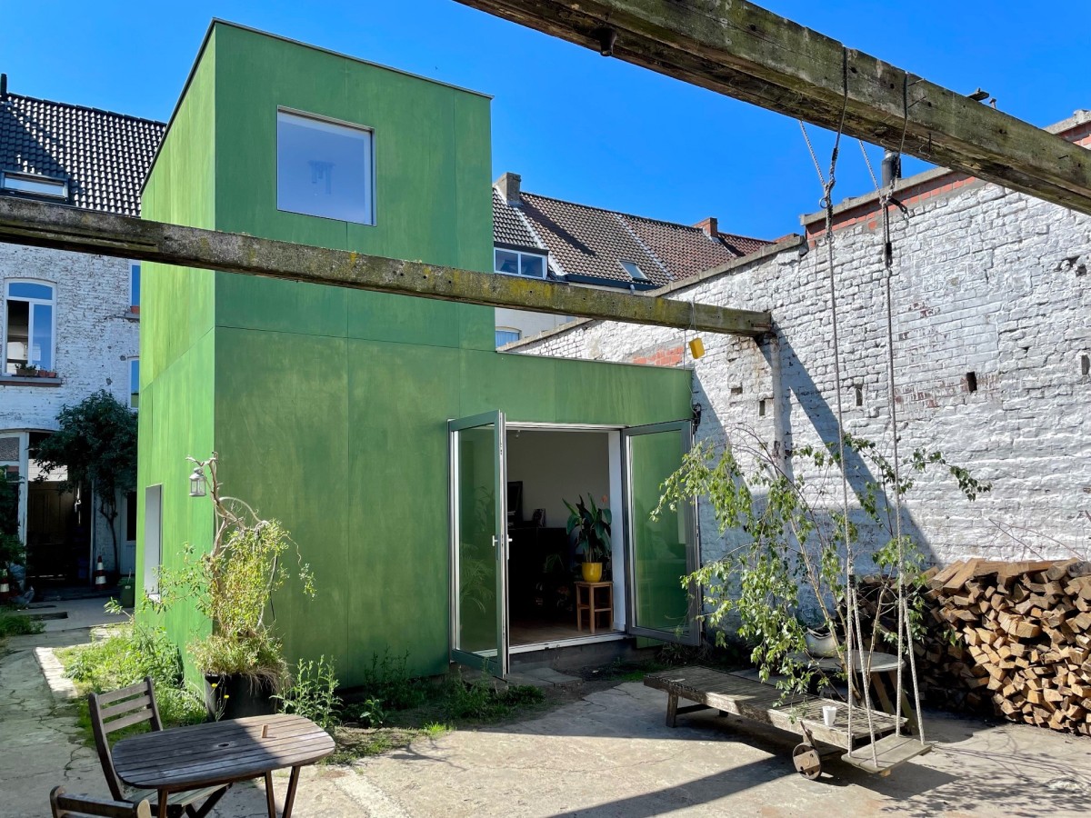
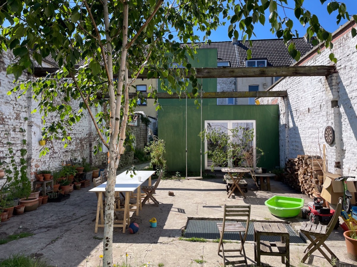
The existing house is located in a closed residential block where the inner area is full of industrial sheds and outbuildings. By demolishing its own shed, we create an open green enclave within the dense residential area. The open space makes it possible to expand the existing house minimally and still retain a large garden. The extension, a new green tower, takes up a position in the spatial context,
contrasts with the surrounding grey mass and attracts the attention of the surroundings without being disruptive. The extension provides the living room, an office and a terrace, and is a link between the garden and the house. It is a timber frame construction whereby the largest parts are manufactured in the workshop in order to realise the shortest possible construction site. It is clad with green-treated wooden façade panels and fitted with aluminium exterior joinery.
Qualities
The new garden is shared with neighbours. In this sense, we did not opt for a glass box, but for an introverted volume, with windows in specific places that offer a view of certain parts of the garden and the surroundings or just let in light. Because of the high gabarit of the demolished shed, we had the opportunity to provide a storey, which would otherwise not be allowed in other extensions. In the floor there is a void that brings extra light into the living room. A cupboard staircase, green like the façade, connects the living room via the void with the office and the roof terrace, where the residents can enjoy the evening sun. On the one hand, the building has an introverted character, but due to the green colour and the height, it still seeks dialogue with the surroundings and adds something lively to the sombre grey inner area.
Texts provided by the submissions for the 2021 Ghent Architecture Prize.
