Javier Garcia Solera (ES)
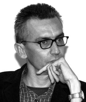
Javier Garcia Solera Vera is especially productive in Alicante. He forms a loose alliance with Alfredo Paya and Lola Alonso, sometimes they work together, sometimes separately, sometimes with others.
You can situate their work in the debate on the new architecture in Valencia which Alberto Penin has it, “La nueva simplicidad, a local, laconic architecture, which is diametrically opposed to the frivolity of spectacular architecture in the major cities. The architecture that can be found in Alicante Garcia Solera, Paya and Alonso reflects a restraint and simplicity. She falls into the context only by her sobriety.
Javier Garcia Solera develops a cool, formal and abstract architecture with a clear expression of structure and function. Carmen Jorda Such describes it as an architecture stripped sober and at the same time sensitive.
His main focus is going to matter itself and the construction. It is an architecture where construction methods and materials self inspiration for further developments in the project.
There is no search for metaphorical references or physical reflections on the essence of architecture. Nor is there a need to develop a new architecture that contained the perils of modernity and cosmopolitan city. The essence of his architecture is a sense of reality that he answers with construction materials and details in his projects.
This attitude stems mainly from the recent Spanish architectural history, in which the technical skills of previous generations have become a tradition and have been an important contribution to contemporary developments in the Spanish architecture. In that sense, his work strongly rooted in the teachings of the modern movement and he has his sense of construction and tectonics undoubtedly inherited from his figurehead, his father, Juan Antonio García Solera who was particularly active during the 50s in Spain.
It’s not just his skill and tectonic influence of the modern tradition that will determine the quality of his work. An important element in his work is his research into the meaning of the patio coming back almost every work. It is a traditional achitecturaal phenomenon, typical of the region, which he gives a contemporary translation in his work.
Very closed buildings hide the transparent and airy feel inside. Each time, patios conceived in a different way: recessed, semi-open, linear, rhythmic. This is the stamp that carry almost all of his projects. This strategy allows a certain freedom in the choice of lights and views and allows to determine the orientation. This design approach requires the utmost accuracy in a three-dimensional shape – through cuts and lichtstudies- that can be obtained within an optimal atmosphere.
By this important factor of the introverted character of his architecture does not mean that he shut himself in the area. Instead, he always takes a different position depending on the environment or context of the project. His response to the environment changes, and has nuances, as it is depending on its characteristics. He turns his buildings almost entirely inside when the environment eg is uninteresting or unpleasant.

The exemplary example of Aulario 3 ‘is a beautiful illustration of this. But the “Edificio de oficinas Diputacion de Alicante” which he co-designed with Alfredo Paya and he put his hand through the contribution of the patio to the unfavorable location and orientation.
In contrast, the introverted character of the Instituto Bernabeu ‘rather the result of a program that requires intimacy. This project fits subtly into the domestieke typology of the urban fringe where it is situated. It is a building of 1200m² in an area where the buildings per parcel not exceeding 200m². It adapts however such in its environment by its sensitivity to scale, it is unobtrusive included in this typological landscape. The concatenated volumes, patios between, break the shell of the building and give it an airy feel inside.
An exception to its predominant inward architecture is the pavilion at the port of Alicante (Pabellon de servicios en el puerto de Alicante). It reveals the lightness and transparency and is aimed at the horizon of the sea ### center:. 2609 ###
These are some projects that without more evidence his sense of contextual integration and scale. His attitude to the context is certainly not ignoring the contrary, it interprets the context in which his architecture in a respectful manner complements its immediate surroundings. Nevertheless, his work with a certain detachment, especially through its far-reaching abstraction and simplicity that sometimes contrast with the surroundings, but also by the deafness of its facades that the story of his architecture usually conceals. But once inside, this strange feeling and objectivity is broken.
Technical skill, attention to detail and materials, he usually in his nakedness and, together with a sense of interpreting the context lead him to an architecture that is both simple and sensitive.
Aulario 3 Universidad De Allicante
In the university site of Alicante – San Vicente de Raspeig -, an amalgam of new quality Iberian architecture (which includes works by Siza, Alonso, Paya Garcia-Solera) state auditorium 3 unobtrusively next to the nearby motorway, on the edge of the campus . Without pretense disappears almost in the horizon. Two other projects at this university site bearing his signature; ‘Centro de Technologia “that he designed along with Alfredo Payá and’ Edificio Germán Bernácer.
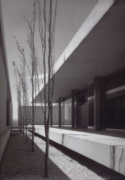
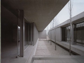
Surrounded by parking the Aulario 3 turns inward in a concrete shell that is broken repetitive through narrow openings that indicate the inner patios between the different volumes which the building is constructed. It seems like it wants to protect itself against the surrounding noise and disturbing views. Unlike the closed concrete walls you are confronted inside with an unexpected lightness and transparency that will determine the atmosphere.
Aula 3 is the result of several factors – such as time constraints and existing foundations – which afterwards have the design determined. Only six weeks was provided to design the complex and only six months to draw up the building. Moreover, there had to take into account existing foundations. With this data Garcia-Solera puts seven different volumes – reduced to simple solid untreated concrete boxes – together. Only 1 level was possible because of the tax, but the foundations left to open it to let a narrow strip between the volumes that lets penetrate the light and gives the whole interior an airy feel.
These limitations have led to a highly efficient, meticulous architecture and a creative approach to the siting and modulation of the classrooms. Both the implantation and the organization of the building have been driven to extreme simplicity with attention to light control as overhanging eaves and slats between the classes.
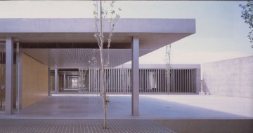
The building consists of seven volumes – of which five identical and different – which are perceived as one large space inside, the transparency of the fill materials used and the continuous horizontality between the different volumes of the concrete roof and the floating floor surface. An elegant structure and design is achieved here with a nod to Mies Van de Rohe.
The horizontal continuous space between roof and floor slab shows a similar structural elegance as the icon of the Farnsworth house. The five identical volumes each consist of two auditoriums and a functional timber volume that bathroom, lockers and comprises a staffroom and constituted a sort of buffer to the underlying auditorium. The first two volumes are slightly larger in section and include store, reception and several smaller rooms. A break of the roof in the second volume allows for greater open outdoor area at the entrance and gives spaciousness to the whole.
The different volumes are connected to each other by metal gratings, which forms a central axis through the building and the open – closed sequence stress when going through the building. The repetitive nature of the whole building makes it easily readable. In a subtle, delicate way, the auditoriums are separated by vertical slats that regulate the zoninval and simultaneously give privacy without breaking the ongoing continuity between different volumes.
The structural and constructional design is shown in all its honesty. HEB 220 profiles absorb the vertical loads on. In a plane lying behind the slats or the glass are provided, which make an ambiguous separation of the different volumes.
The lowered ceiling, behind which the wiring for the techniques is, appears to float below the roof. No attempt is made to hide the grid, on the contrary, by every interrupt abruptly, the system of suspension emphasized even more and give it a whole also a repetitive nature.
From the outside it looks like an ambiguity in the structural efficiency, the massive concrete walls to float above the ground, as a challenge to gravity.
“The materials are overexpressed in all Their nakedness: triply dividing walls, false ceiling in metal with visible joints, spans crossed by metal duck-boards The style is stamped with the seal ‘more is less’, and Responds with its own logic to. the circumstances. “
The building is clearly arise from a constructive and structural approach, which will determine the building’s character. The relation interior – exterior is mostly inside the building between the volumes and the patios from the outside the building is very distant and closed. Carmen speaks of the Such an internalized architecture. This is the stamp that bear many of his projects.
The design is very typical of his work, precisely because it again shows dedicated to construction materials and detail. The constructive, structural elements have to show an aesthetic value them properly, emphasizing, instead of hiding them. It is part of the concept and makes the building even easier.
From ‘Spanish Minimalism’
Thesis Gina Felix KULeuven 2002-2003 pag.29- 39.
Projects lecturer at Alicante School of Architecture since 1999
1986 1st Prize. Alicante Government Office Building
1988 Prize Europan 1
1989 1st Prize. Dwellings within walled precinct of Madrid
1995 1st Prize. Chemical Technology Centre, University of Alicante
1997 1st Prize. Dock and Quay, Alicante Harbour
1998 1st Prize. Elche Branch of CoAA
2000 Balearic Islands Tourist Technology and Research Centre

