KMSKA: two worlds within one building
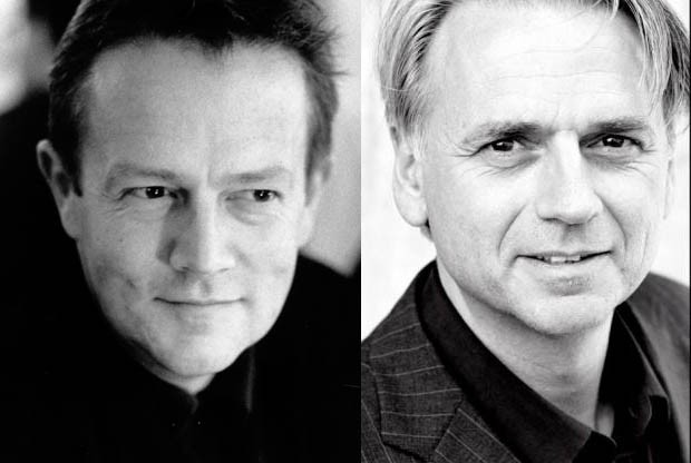
 KAAN Architecten The studio, led by Kees Kaan, Vincent Panhuysen and Dikkie Scipio, consists of an international team of architects, landscape architects, urban planners, engineers and graphic designers. KAAN Architecten believes in cross-pollination between projects and disciplines as an essential tool to foster a critical debate within the studio. Since the launch of the firm, KAAN Architecten has handled and supervised a wide range of projects, actively working with the private and the public sector, with project teams that become increasingly multidisciplinary and dynamic. KAAN Architecten maintains a culture of constant evolution, which is essential in a profession that changes at a rapid pace. KAAN Architecten seeks to uphold long-term relationships with its clients, consultants and partners. KAAN Architecten’s projects transcend the traditional notion of scale and typology, ranging from furniture and interiors to urban development and from retail and offices to museums and buildings for health and education. The firm expanded its international presence with satellite offices in São Paulo (2015) and Paris (2019), led by Renata Gilio and Marylène Gallon respectively. Both branches continue the multidisciplinary design approach set out by the Dutch headquarters.
 KAAN
KAAN
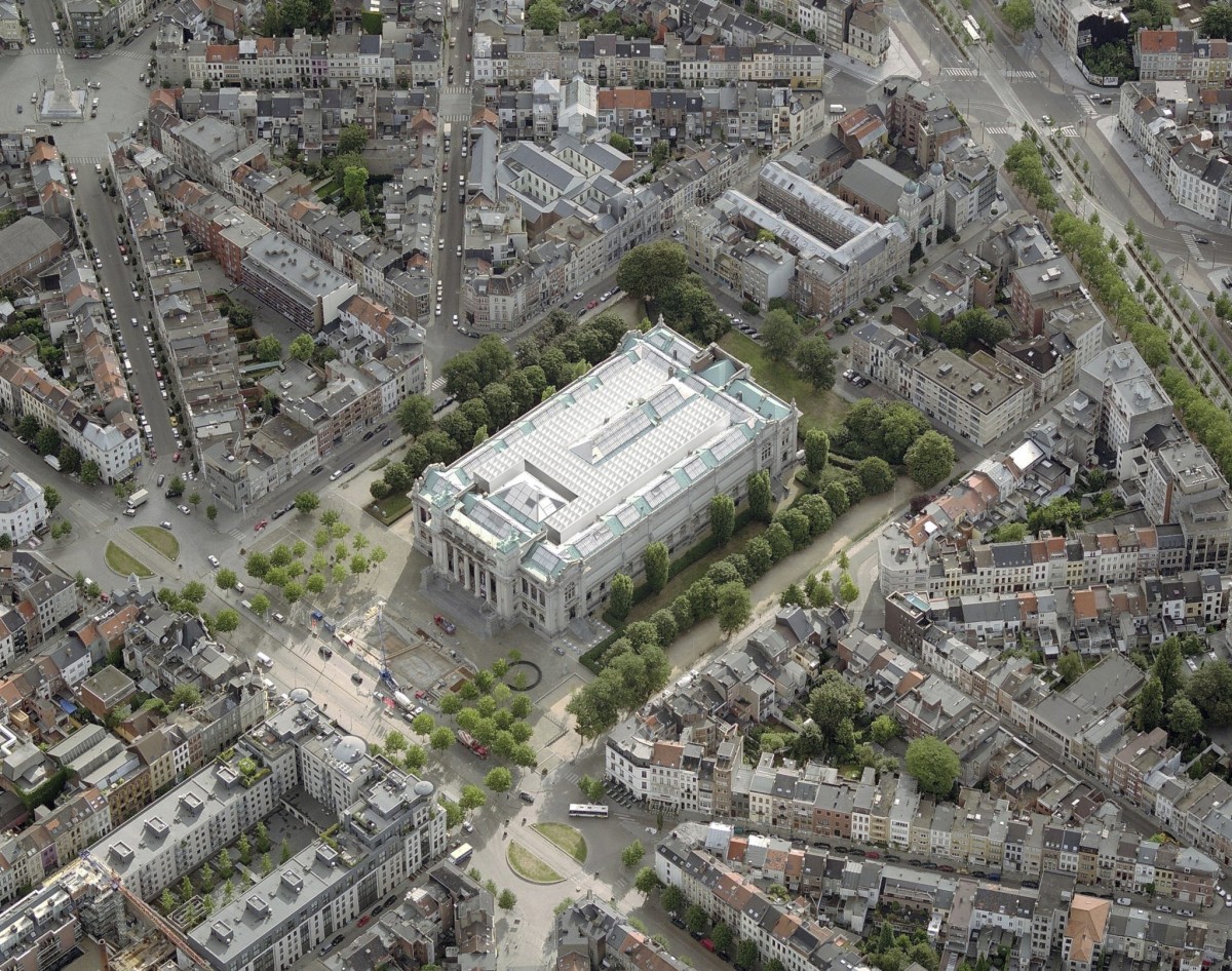
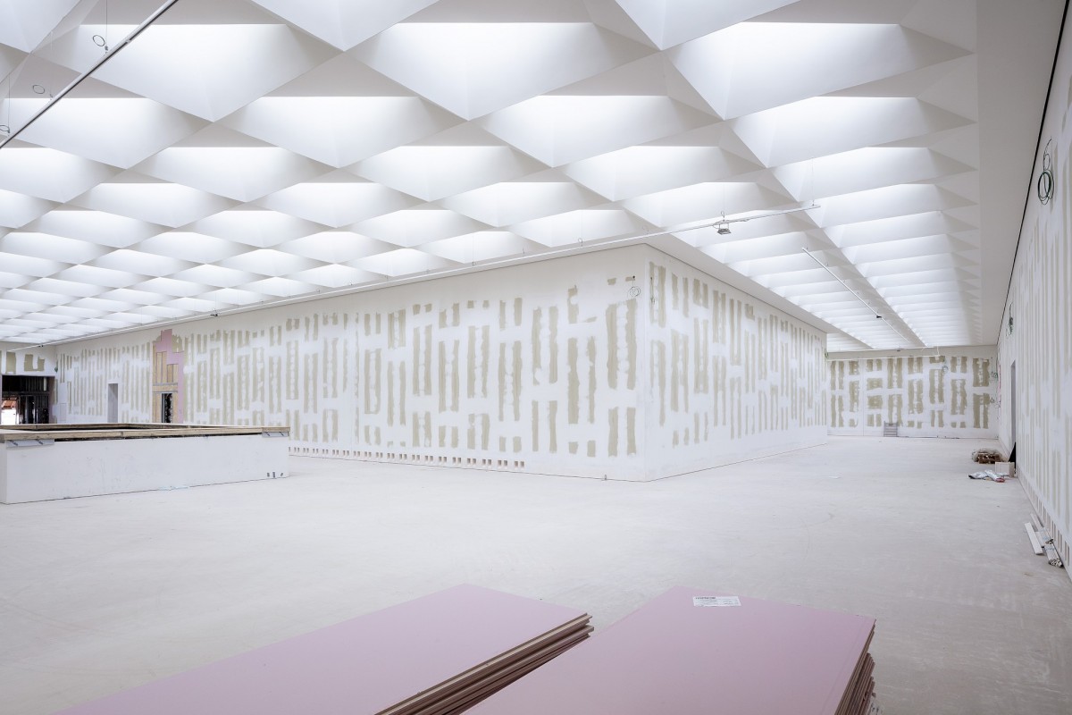
The Royal Museum of Fine Arts was part of the 19th-century expansion of Antwerp’s city centre. The original building had high ceilings and wide spaces, but during the 20th century the museum underwent many haphazard changes: courtyards were covered, windows were closed off, new walls were added and the logical routing of the original whole was disrupted. This intervention aims to reverse this disruption by defining three main functional areas: a public block, the museum including its storage space, and staff and guest rooms. By adding an extension the original routing is restored and allows an integrated exhibition space with six courtyards for the addition of a new ‘vertical’ museum: open ceilings, staircases and elevators for new levels, and double walls for a new independently experienced routing. The interiors have a succession of colours: from the grey-yellow of the vertical museum to the characteristic golden-brown of the Rubens and Van Dyck rooms, and through to the old Pompeiian red of the staircase.
”We want to preserve the powerful 19th-century building as much as possible so that you can relive the old museum as it was while the new vertical museum offers an equally strong but totally different experience of space.” The impressive 19th-century entrance hall gets its 21st-century equivalent.
 Karin Borghouts
KAAN architects has other realisations in Belgium.
Utopia, the Library and Academy for Performing Arts, is situated on the corner of Oude Graanmarkt and Esplanadestraat in Aalst. The 8.000 square-meter brick structure incorporates a striking historic building from the second half of the Nineteenth century, the so-called Pupillenschool, and rejuvenates the urban landscape while elegantly giving expression to the required functionality. Both outside and inside, the historic façades blend perfectly with the generous spaces, while the brickwork dialogues with light gray concrete elements. Taking its cue from Thomas More’s acclaimed book “Utopia”, first printed by prominent Aalst citizen Dirk Martens, the new building has a functionally driven plan in order to achieve a sense of spatial freedom and it has been slotted into the urban fabric to enhance the characteristic irregular streets and intimate spaces of the city center.
Crematorium Siesegem, is located in the countryside just outside of Aalst, Belgium. Trees and shrubs line the perimeter of the plot while the crematorium is situated in the middle, with a footprint of 74 by 74 meters. The surrounding greenery is envisioned as an extension of the crematorium space and is an important part of the funeral ceremony. The south-western corner of the building opens onto a patio and serves as a transitional zone, welcoming visitors and pulling them inwards. Once inside, a clear sequence of spaces unfolds so the visitors never feel lost, with architecture offering spatial guidance. The crematorium encompasses two ceremonial assembly halls each flanked by a family room and a place for condolences opening towards an outdoor area. The goal was to design a building capable of internalizing the landscape so that its tranquility could console visitors and provide strength. Therefore, interior spaces are strategically oriented within the landscape to create enclosed patios blurring the distinction between interior and exterior. Next to the ceremony spaces, the technical aspects of the building are also a fundamental part of the design. The cremation process is disclosed rather than hidden, creating an unusual yet effective polarity between the mechanics and the serenity.


