Architecture as fossilized music
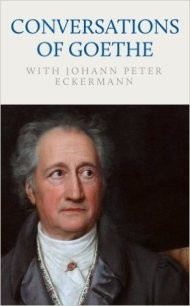 The title of the lecture is from ‘Gespräche mit Goethe in the light of Jahren seines Lebens’ by Johan Peter Eckermann.
On Monday, March 23, 1829, Eckermann notes the following words of the master: “I have found a paper between my papers, which I call the art of building music. And, indeed, that has something: the mood of architecture the effect of music comes after. “_
CONCERT BUILDINGS BRUGGE AND ARCHIPLE WORKS.
Early October, Archipel organizes ‘building art as a dazzling music’ within the season theme “Metamorphosis: transformations / edits” of the Bruges concert hall. Architecture and Music!
The concert building names the inspirational metaphysics in Bruges.
In an interview of 2009 following the exhibition ‘Pacing through Architecture’, Paul Robbrecht describes how to apply color, rhythm and movement in the building and how this leads to a musical aspect. “In the Concertgebouw in Bruges, the colors were created when I was browsing a book about color use at Le Corbusier. I was struck by the word ‘Farbenklavier’. Also in English is called a color row ‘a color piano’. A color piano: we had to do something about it in Bruges. Color is a pictorial alibi. A presence that builds its own subversive story against the gravity of architecture. But also a fluid, a light test, a form of musicality.
Inspirational metamorphosis: seven notes in the ‘Farbenklavier’ of Bruges.
As music transformed Robbrecht & Daem’s design, we put seven metamorphoses in the viewer, seven notes in Bruges’ Farbenklavier.
Nuts dealing with the historical context of Bruges in a meaningful contemporary way. The seven projects are illustrated enthusiastically by the respective architects. Now in Bruges on a cultural level, a fresh and sparkling wind blows us through the architectural perception of Bruggeling over his city Bruges, through the architectural art of these seven metamorphoses.
Cultural House The Republic | Dertien 12.

Central to St. James’s Quarter in Bruges, we help transform the transformation of the ‘The Republic’ building complex into a creative city hall.
In addition to a ‘stone’ renovation, the Republic is equally a ‘mental’ rebuilding within the neighborhood, giving us substantial impetus to the cultural and urban creativity of the historic city center: a bridge pilot project on innovative cooperation. We set the ground for a network within St Jacob’s district, where we discover connections between the various players, organizations, individuals, tourists and residents, all of whom work together, live and relax. The way we intertwine this centuries-old patrimony and its large courtyard with the surroundings make the building block sparkling with urban life. A new open office for creative entrepreneurs is being built on the current flat roof, which makes the urban site decentralized without building unnecessary open space. The historical footprints and patterns in a heritage city like Bruges, apart from a challenge for urban renewal, represent an extremely intriguing setting for future impulses, with the rebuilding of the republic as a catalyst for the splendid future of Bruges. With our energetic generosity, we hope to be a contagious compass, a lever for future, neighborhood-enhancing dynamics within our (city) city.
Project Ruth Sint-Jakobsstraat | Urbain architectencollective.

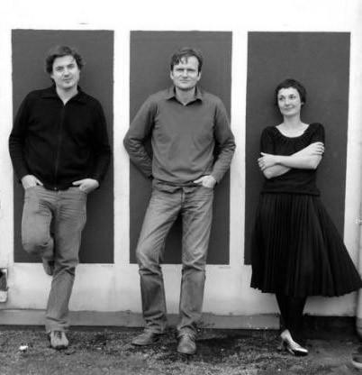
urbain architectencollective is a collective of architectural and urban designers established in 2007 by ir.arch. David Claus, ir.arch. Dieter Delbaere and arch. David Niville. The collective builds on a rich portfolio of projects of various scale levels and with different programs. The collective is working on the renovation and new construction of homes, offices and public buildings. In addition, the re-destination of built heritage is often a topic. At the same time, it is also active in urban planning projects: master, image quality, construction plans, city designs and church planning plans.
Urbain architectencollective aims at highly considered, well-grounded and clear design proposals. They are a clear answer to the program requirements, the budgetary framework and the spatial context. The work, both architecture and urban design and studies, is characterized by a clear (social) position but at the same time a strong pragmatic, rational and realistic attitude.
Urbain architectencollective aims at highly considered, well-grounded and clear design proposals. They are a clear answer to the program requirements, the budgetary framework and the spatial context. The work, both architecture and urban design and studies, is characterized by a clear (social) position but at the same time a strong pragmatic, rational and realistic attitude.
Ruth Designs
In the Sint Jakobsstraat, Urbain architects collectively recreates a historic corner building. It is a shopping mall with accompanying apartment and a sewing studio in the attic. Due to the position on the corner of Sint Jakobsstraat and the Ezelstraat, there is virtually no outside space on the back of the plot, which has been built up over the years by various buildings.
Daylight only enters through roof domes.
The client wishes to set up a new retail space in the building, combined with a duplex apartment and three student rooms with communal kitchen.
The plot is being erected. This creates a larger outdoor space and can bring more light into the living areas. A new traphal will be introduced to control circulation to all entities. Both the store and the apartment and the three student rooms are unlocked by the traphal. The staircase joins the entrance hall of the ground floor. The stairwell is fully glazed, with steel joinery and prefabricated concrete stairs.
The design focuses on a high degree of sustainability, a challenge given the historic character of the property and the strict regulations in the Bruges inner city. In order to preserve the facade in its original condition, it is chosen to isolate the building completely along the inside and to work with steel front frames, which are placed in the insulating line. At the same time, a ventilation system D with heat recovery is provided in the duplex apartment shop and the student rooms are equipped with a ventilation system C, with windows in the side windows.
The implementation was carefully prepared because of the complexity of the renovation. Placing a crane at the location is not evident (Sint Jakob Street is one of the main roads to Bruges city center). Therefore, a prefabrication system was devised for the execution of the steel structure of the stairwell. By incorporating them as a composition of different steel cages, the tube can be mounted in one day. Subsequently, the prefabricated stair wings and dishes can be placed from the top into the tube.
A few simple operations ensure proper spatiality in the store and an internal staircase provides connection between the ground floor and the floor. Much attention was paid to the position of a new video, based on structural logic.
The Golden Tree | 3 Architects.

The Golden Tree project stands for contemporary architecture in the historic center of Bruges. A thoughtful combination of authenticity, design and comfort.
The project is on the old Brewery ‘t Hamerken brewery, where beer has been brewed since 1455. The expansion project is built around a central green interior courtyard and provides 32 apartments with a spacious living area, one dwelling and four trading spaces. Underground there are car parking spaces, above ground a spacious bicycle storage room. The interior area is open during the day as a public transit between Langestraat and Verbrand Nieuwland. A fresh white building around a green courtyard referring to the beguinage. Whoever walks in Bruges does not experience the white, but the many richly colored colors of brick and pans. For this reason, a multicolored slate was chosen, which uses both the walls and the roofs. They color, bundle and mark the ensemble and form an excited architectural whole with the sloping roofs and walls. The project does not want to be a big gesture, but is designed from within with attention to sight and sight lines. The complexity is not taken into account, due to the ongoing interaction between the present and the past. The brewery chandelier and the chimney remind the industrial past. The views through the buildings give a view of the Bruges skyline from the terrace.
Primary School De Springplank | Studio Thys Vermeulen & Carton 123

De Springplank marks a kind of standard, a school example of public architecture that sets simplicity and service as a standard.
This project for a new elementary school was built on a beautiful neo-Gothic site in the center of Bruges. The building with its pronounced roof form seeks an empathetic bond with its historical context. A sophisticated deep brick architecture with a strong vertical rhythm addresses the neogotic theme of the historic neighboring buildings.
The project was awarded the “Award for Architecture West Flanders 2015”, a four-year award for excellent buildings. The jury praised the discreet but dramatic ensemble of classes. The brick building volume carries out a managed pass-de-deux with the existing school … Despite the scarce public resources, there is an architecture of soberness which, in terms of space and experience, makes a generous impression. Primary School The Springboard marks a kind of standard, a school example of public architecture that sets simplicity and service as a standard.
Historical Diephuizen | Atelier Tom Vanhee.

The client wishes to reactivate the property of the 2 protected 17th century private diephuses. This ambitious company together with the consultation with the authorities is the driving force of this project.
Huyze Hertsberge | Viérin Architects.

An intimate city garden, emitted on the scenic Green Reed in Bruges, is the decor of this small project. Huyze Hertsberghe is a renowned five-room guesthouse.
In the corner between the house and the old orangery we built a winter garden with small kitchen and dining area for the guests. The special setting, coupled with the small size of the new building, demands a certain sophistication. Against the backside of the house we put the roof high above the window of the lounge so that we disturb the light as little as possible. On the other hand, we close on the roof of the little orangery. This results in a sloping roof, carried by a sequence of chrome-plated pellets that accomplishes the twist of one form to another. Over the lead-roofed roof we let the rainwater of the dwelling house flow into the garden, emphasizing the roof shape, as well as the special relationship between garden and winter garden.
Rehabilitation ‘t Zand | West 8 & Snoeck Partners

A plan that restores the medieval structure of Bruges and eliminates the ugly cross section that separated from the city in the 20th century West Bruges. Moreover, in this project, ‘t Zand’ is not just a roof above a parking, but a full square. (Dixit Mayor Landuyt 2015)
The design has the ambition to balance the maximum available space for multifunctional use with the intimacy that is necessary to make the square attractive and cozy. The square is equipped with a robust pavement in a mosaic of surfaces and the necessary technical facilities to allow a multifunctional use. Within the assignment, new access to the underground bicycle shed is being built and part of the tracks opened. Due to its location, full within the historical core, ‘t Zand is an important link in the network of squares. The urban evolution of ‘t Zand has already transformed the square several times in image and experience. A sequence of interventions; railroad racing, road infrastructure, traffic jams, have increasingly removed a balanced alignment of the square within the medieval city fabric. This created a barrier between the center and West Bruges. The square was functional but felt big and empty. The square is intended to give the square a full-fledged ‘Brugs’ character with its valuable historical-cultural and landscape layers. The redevelopment is based on a subtle emphasis on some existing spatial features.
• Park experience in the square. The central square, ‘t Zand, originated between South and Noordzandstraat, preserves its open character. From its multifunctional use, the square retains its maximum openness.
• Reduce car traffic. The car traffic is reduced to a maximum, but it provides for the necessary accessibility and connection of the street fabric.
• Completion of the square edge. The gaping void at the tunnel tunnel near the Smedenstraat is filled with a building. The completion of the square wall through a new building encloses the square all the way.
The pavement is filled in as a mosaic of surfaces. A series of scales are hereby brought together; the large scale of ‘t Zand in relation to the other major squares in the inner city such as Markt and Burg. The faceted division matches the more intimate space around the Concertgebouw.


